
Easter Basket Handmade Card Tutorial Featuring CutCardStock and Layered Die Cutting
- Rick Adkins

- Mar 10
- 4 min read
Updated: Mar 17
There’s something about Easter cards that makes me want to lean into softness and structure at the same time. Pastels. Clean lines. A little nostalgia. When I sat down to create this picket fence Easter card, I knew I wanted it to feel fresh and cheerful—but also intentional. Not fussy. Not overworked. Just layered in a way that feels thoughtful.
This design pairs beautifully with the companion tutorial I created for CutCardStock, but here I want to share more of the why behind the choices—and how you can adapt this idea with supplies you already have.

Why a Picket Fence Layout Works So Well
A picket fence background instantly creates structure. It gives your eye a place to rest while still allowing a focal point to shine. In cardmaking terms, it acts like a subtle frame.
Using Cougar White Smooth CardStock 110 lbs for the card base was an intentional decision. When you’re building a layered die cut card like this, especially one with stacked fence panels, you need a sturdy foundation. A heavier white cardstock keeps everything flat and professional-looking. It also creates that crisp contrast that makes spring colors pop.
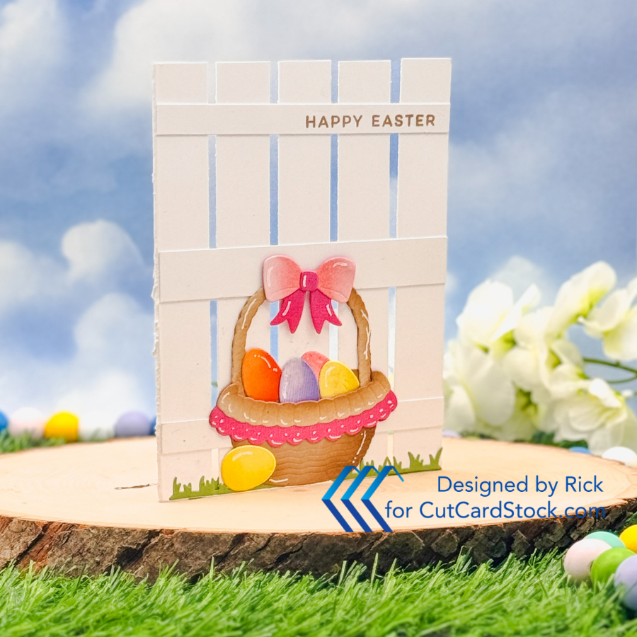
The fence itself is simple paper cutting and adhering—but visually, it feels detailed. That’s one of my favorite design strategies: create interest through repetition instead of complexity.
If you don’t want to cut fence slats, you could:
Use a striped embossing folder
Score evenly spaced lines
Or even stencil subtle vertical lines for a softer look
The concept is structure—not necessarily a literal fence.

Color Choices That Feel Cohesive
Spring color palettes can easily get chaotic if we aren’t careful. For this card, I intentionally pulled from two CutCardStock collections:
Pop Tone Cardstocks (Banana Split, Gum Drop Green, Orange Fizz, Pink Lemonade) DSC Discount Cardstocks (Sand Castle Tan, Natural Tan Kraft, Hydrangea Purple, Fruit Punch Pink)
The key was balance. I chose warm neutrals (Sand Castle Tan and Natural Tan Kraft) for the basket so the brighter egg colors could stand out. When you ground a design with a neutral, the brighter tones feel intentional instead of overwhelming.
This is a helpful principle for any handmade Easter card: Bright focal points need a quiet supporting cast.
If you’re shopping your stash, look for:
One or two neutrals
Three coordinating brights
One green for grounding
That formula rarely fails.

Layered Die Cutting Without Bulk
The Easter Basket Die Set from Pixi Dust Designs and the Nested Eggs Die Set (SBC) make layering easy, but the real magic happens with subtle ink blending.
A little shading along the edges of the die cuts adds depth without foam tape. This keeps the card cleaner and more mail-friendly while still feeling dimensional.
If you’re newer to ink blending, here’s a mindset shift: You’re not trying to change the color. You’re just adding shadow.
Even a slightly darker tone around the edges can elevate a flat die cut into something that feels finished and polished.

Keeping It Clean and Simple
Even though this card has layers, I still consider it clean and simple. Why? Because the background is monochromatic and the layout is controlled.
The “Happy Easter” sentiment from the Hello Spring Stamp Set is placed across one fence panel to reinforce that horizontal line. That alignment keeps everything visually grounded.
When designing clean and simple cards:
Limit background color
Repeat lines and spacing
Keep embellishments intentional
The white gel pen highlights on the eggs were the final touch. Small details can add personality without clutter.

Make It Your Own
This layout is incredibly stash-friendly. You could:
Swap the basket for florals
Turn it into a Mother’s Day card
Use patterned paper strips instead of white cardstock
Change the sentiment for birthdays or thank-you cards
The real takeaway here isn’t just the supplies. It’s the structure. Once you understand why the design works, you can reinterpret it for any occasion.

That’s what I love most about cardmaking—it’s not about copying a project. It’s about learning the principles and making them yours.
If you try a picket fence card design, I’d love to know what theme you choose. Do you go pastel and classic, or bold and modern? Let me know in the comments—I always enjoy seeing how you take an idea and run with it.
Thanks for dropping by today I hope that you found a little spark of creative inspiration with my project today. Wondering what I used in this project? Everything is linked to multiple sources in the thumbnails in the Materials Used section, or in the text below. Compensated affiliate links used when possible.
Materials Used:
Here you will find the list of supplies that I used to create today's card. All supplies are linked to supply sources below. Compensated affiliate links may be used at no cost to you.
Happy Crafting,

Rick Adkins
Affiliate Disclaimer:
Just a friendly reminder, as part of my commitment to transparency, please note that some of the links provided maybe affiliate links. This means that if you make a purchase through these links, I may earn a small commission at no extra cost to you. Your support is truly appreciated!
Additionally, I kindly ask that you always accept the tracking cookie for the affiliate websites. Rest assured, this will not in any way expose your computer to viruses or compromise your information. It's simply necessary for the company to attribute the sale to the affiliate, ensuring creators like myself receive their rightful commissions.
Your trust and support enable me to continue sharing creativity through my email lists, blog, and YouTube channel. Thank you for being a valued part of our crafting community!


Comments