
How to Balance Patterned Paper and Stamped Images on a Handmade Card

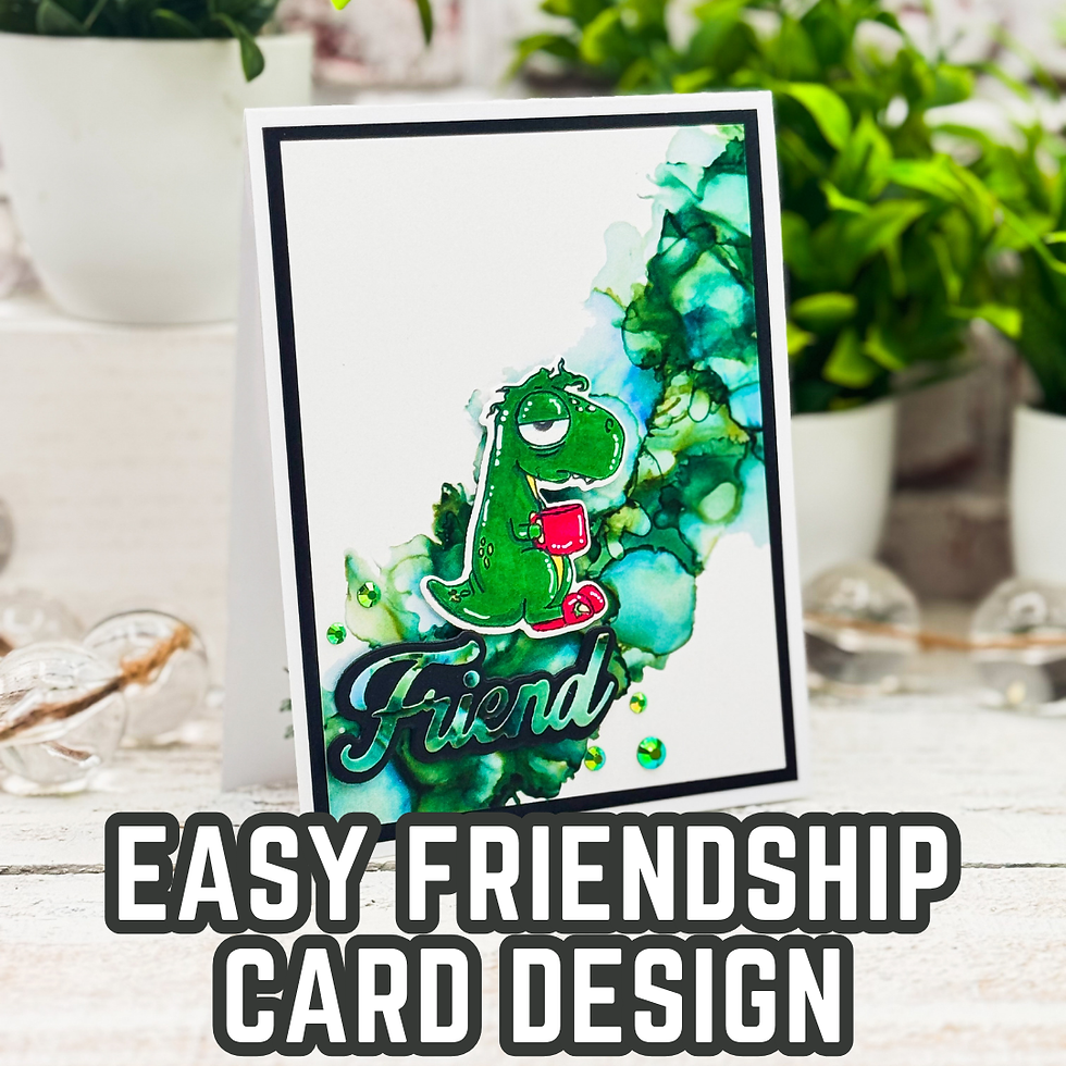
One of my favorite things about cardmaking is finding that sweet spot between a background that adds interest and a stamped image that still gets to be the star of the show. Patterned paper can be beautiful, but it can also compete with your focal point if we're not careful. On this friendship card, I wanted to use a fairly bold patterned paper while still keeping the little dragon front and center.
For this project, I reached for products from The Rabbit Hole Designs, including the Caffeinated Critters Stamps and Dies Limited Edition Set 2, the Sassy Sentiments Friendship Stamp Set with Dies, and the Getting Inky 6x6 Paper Pack. I colored the stamped image with Ohuhu Honolulu Alcohol Markers and used die cutting to give the images and sentiment a little more presence.
But the real lesson behind this card isn't the particular stamp set or paper collection. It's about how to use patterned paper without allowing it to take over your card design.
How to Balance Patterned Paper and Stamped Images on a Handmade Card
When I'm working with patterned paper, I usually start by deciding which element needs to be the focal point. In this case, that was the little green dragon.
Once I knew that, I could make decisions about everything else based on supporting that image rather than competing with it.
The Getting Inky 6x6 Paper Pack has a lot of movement and color in it, so using a full sheet as the background would have made the card much busier than I wanted. Instead, I used the patterned paper as an accent area, allowing plenty of white space to remain visible.
That white space is doing more work than you might think.
It gives the eye somewhere to rest and creates separation between the busy background and the stamped image. This is one of the easiest ways to make a card with multiple elements that still feel intentional and clean.

Let Your Patterned Paper Do the Supporting Work
One of the biggest mistakes I see when working with patterned paper is treating the paper as though it has to fill every available space.
It doesn't!
Sometimes a small section of patterned paper can have a much bigger impact than covering the entire card front. In this design, the green and blue pattern creates a visual environment for the dragon without becoming the main subject.
I also like how the colors in the paper reinforce the colors of the stamped image. The greens and blues create a natural relationship between the background and the dragon, while the brighter red accents on the image immediately stand out.
That's an important design trick to remember: your patterned paper doesn't have to match your focal point exactly, but repeating a few colors can help everything feel connected.
Creating a Strong Focal Point with Alcohol Marker Coloring
The dragon is relatively small compared with the overall card front, so I needed a way to make sure it didn't get lost against the patterned paper.
Color was one of the answers.
I used Ohuhu Honolulu Alcohol Markers to give the dragon strong, saturated coloring. The green body immediately separates the image from the softer blue and green tones in the background.
This is something I think about quite often when coloring stamped images: contrast doesn't always have to come from black and white.
You can create contrast with:
Light versus dark
Warm versus cool colors
Saturated versus muted colors
Smooth areas versus busy patterns
Large shapes versus small details
Here, the colored dragon has enough contrast from the patterned paper that the eye naturally lands there first.
You can use the same idea with whatever coloring medium you already have. Colored pencils, watercolor, markers, or even paper piecing can work. The important thing isn't the particular coloring tool. It's making sure your focal image has enough visual contrast to stand apart from its surroundings.

Why I Left So Much White Space
The white area on this card might look like an empty space at first, but I actually consider it an important design element.
Because the patterned paper has so much movement, the white space creates balance. It also gives the dragon room to breathe.
This is one of those cardmaking lessons that took me a while to fully appreciate: empty space isn't wasted space.
When every part of a card is filled with something interesting, nothing has the opportunity to be the most interesting thing.
Leaving an area relatively quiet can actually make the rest of the design feel more dramatic.
That's especially helpful when you're working with cute or detailed stamped images. Rather than adding more embellishments around the image, try giving it more breathing room.
The Sentiment Becomes Part of the Design
I also wanted the sentiment to feel like more than an afterthought.
The large black "Friend" die cut adds a strong visual weight toward the bottom of the card. Because the sentiment is dark, it helps anchor the composition and keeps the bottom portion from feeling visually lighter than the rest of the design.
I particularly like how the sentiment overlaps the patterned area instead of sitting completely inside the white space.
That little bit of overlap helps connect the different sections of the card.
It's a useful trick whenever a card starts to feel like it has separate "zones." Allowing one element to cross from one area into another can visually tie the pieces together.

A Little Die Cutting Can Add a Lot of Impact
Die cutting is another technique that can easily become an important part of the design rather than simply a way to cut out stamped images.
The coordinating dies from The Rabbit Hole Designs make it easy to give the stamped images clean edges, but the larger sentiment die also creates a bold graphic element.
Notice the difference between the two types of elements:
The dragon is detailed, colored, and illustrative.
The sentiment is large, dark, and graphic.
That contrast keeps the card interesting.
When everything on a card has the same visual weight, the design can become flat. Combining a detailed stamped image with a larger, simpler die-cut element is one way to create hierarchy without adding lots of embellishments.

Making This Friendship Card Your Own
The great thing about this layout is that you don't need these exact supplies to recreate the design concept.
If you don't have a coordinating patterned paper collection, look through your stash for a paper that contains two or three colors found in your stamped image.
If your patterned paper is especially busy, try using a smaller section of it rather than covering the entire card front.
And if you don't have alcohol markers, don't let that stop you. Choose whatever coloring medium you're most comfortable with and focus on creating enough contrast between your image and the background.
You could even simplify the design further by using a stamped and die-cut sentiment instead of a large word die.
For a more beginner-friendly version, use a larger stamped image and a simple piece of patterned paper. For a more advanced version, try layering multiple pieces of patterned paper or introducing a subtle stamped background into the white space.
The basic design principle stays the same: choose one focal point and make your other elements support it.

One Design Lesson I'm Taking Away
For me, the biggest takeaway from this card is that using patterned paper successfully isn't really about choosing the "perfect" pattern.
It's about controlling how much of that pattern you use and where you place it.
A beautiful patterned paper can become overwhelming when it fills the entire card. But when you give it a specific job—creating color, movement, texture, or visual interest—it becomes a design tool.
That's why I enjoy projects like this one. The finished card may simply be a fun friendship card featuring a caffeinated little critter, but there are several design principles hiding underneath that playful image.
And those principles can be used again and again, regardless of the stamp set sitting on your desk.
So the next time you find yourself staring at a gorgeous sheet of patterned paper wondering how you're going to use it on a card, don't automatically reach for the entire sheet. Try using just a portion of it. Give your stamped image some breathing room. Look for a few colors you can repeat. And most importantly, decide what you want your eye to notice first.
Sometimes less patterned paper can actually make your favorite part of the card stand out more.
That little shift in thinking can make a surprisingly big difference in your handmade card designs.
Thanks for dropping by today I hope that you found a little spark of creative inspiration with my project today. Wondering what I used in this project? Everything is linked to multiple sources in the thumbnails in the Materials Used section, or in the text below. Compensated affiliate links used when possible.
Supplies Used
Here you will find the list of supplies that I used to create today's card. All supplies are linked to supply sources below. Compensated affiliate links may be used at no cost to you.
Happy Crafting,

Rick Adkins
Affiliate Disclaimer:
Just a friendly reminder, as part of my commitment to transparency, please note that some of the links provided maybe affiliate links. This means that if you make a purchase through these links, I may earn a small commission at no extra cost to you. Your support is truly appreciated!
Additionally, I kindly ask that you always accept the tracking cookie for the affiliate websites. Rest assured, this will not in any way expose your computer to viruses or compromise your information. It's simply necessary for the company to attribute the sale to the affiliate, ensuring creators like myself receive their rightful commissions.
Your trust and support enable me to continue sharing creativity through my email lists, blog, and YouTube channel. Thank you for being a valued part of our crafting community!


Comments