
Four Halloween Card Layout Ideas That Make Pattern Paper Shine

I recently shared a full tutorial on the Unity Stamp Company blog showing how I created four coordinating Halloween cards using a fun collection of spooky images and patterned paper. In that post, I focused on the products and overall project. Here, I want to take a step back and share the creative thinking behind the designs—why I chose this layout, how I approached the color combinations, and a few ideas for making the concept work with the supplies you already have.
One of my favorite things about cardmaking is discovering a layout that can be used over and over again. When I find one that works well, I rarely stop at making just one card. Instead, I'll cut enough pieces to create several cards at the same time, changing only a few elements to give each one its own personality. That's exactly what happened with these Halloween cards.
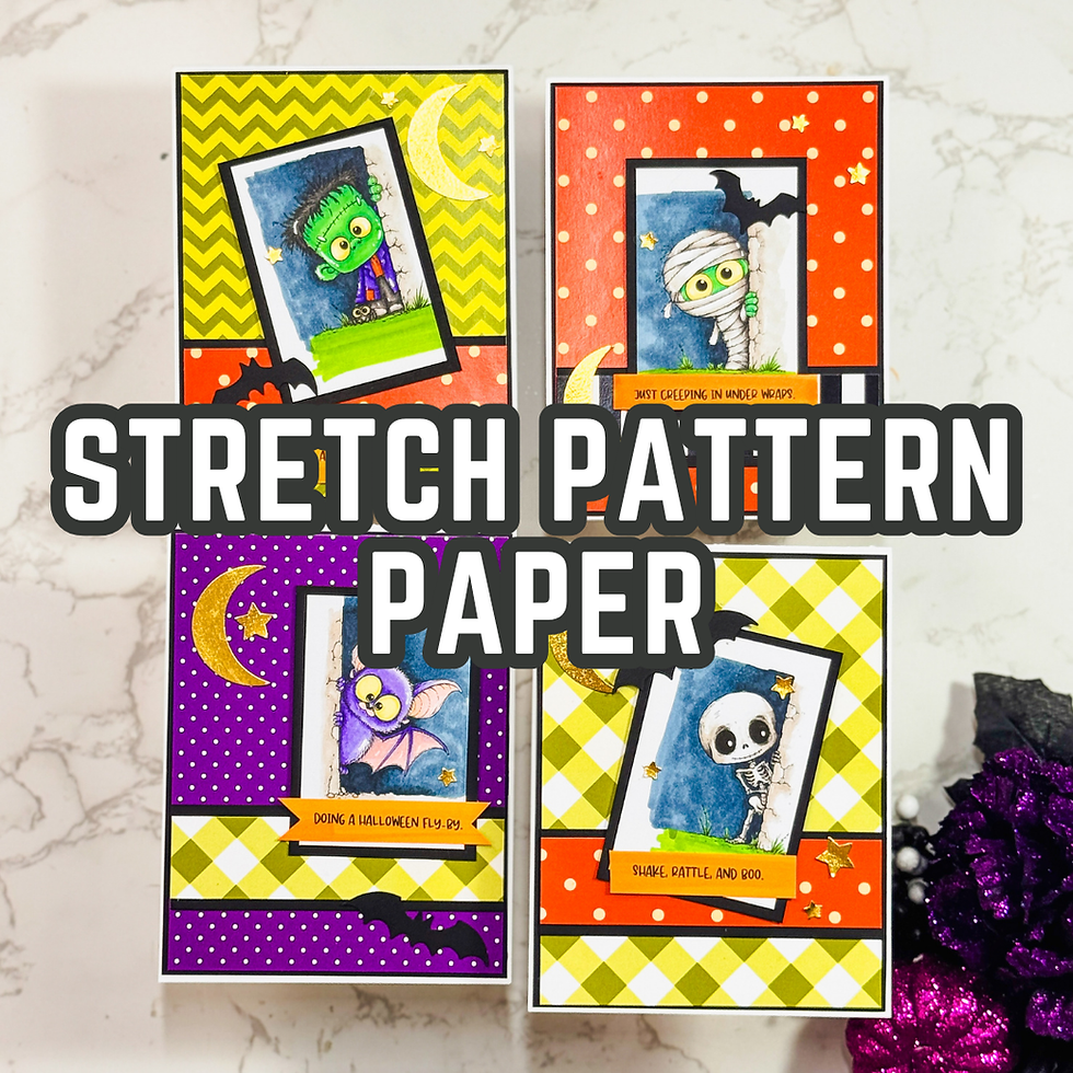
Why I Chose One Layout for Four Cards
When I'm creating multiple cards, I like to remove as many design decisions as possible. Instead of reinventing the layout every time, I settle on one that feels balanced and interesting.
For these cards, I wanted the adorable Halloween characters (from the The Creepy Peekies Stamp Set) to be the stars of the show. Tilting the focal panel gave each card a playful, slightly whimsical feel that matched the images perfectly. That single design choice added movement without making the layout more complicated.
Repeating the same structure also helped the entire collection feel cohesive. Even though each card features a different character and different patterned paper, they still look like they belong together.
That's a simple trick I use often whenever I'm making cards as a set.

Let the Pattern Paper Do Some of the Work
I think many cardmakers—including myself sometimes—forget how much heavy lifting patterned paper can do.
Instead of treating it as just a background, I wanted it to become an important design element. The bold Halloween patterns added energy before I even stamped an image. Because the papers already coordinated with one another, choosing combinations became much easier.
I also tried to resist covering too much of the paper.
That wasn't easy.
My instinct is usually to keep layering until every space is filled, but these cards reminded me that sometimes the background deserves room to breathe. Leaving larger sections visible helped showcase the patterns while keeping the cards bright and fun instead of busy.

Why the Black Layers Matter
One decision that almost always finds its way into my Halloween cards is adding black matting.
It may seem like a small detail, but those thin black borders completely changed the look of these cards. They created separation between the colorful papers and the stamped images while giving everything a crisp, finished appearance.
Whenever I'm working with bright oranges, greens, purples, or lime tones, I find that black helps anchor the entire design. It's one of those simple techniques that gives a project more definition without requiring extra embellishments.

Keeping the Coloring Simple
The images are full of personality, so I didn't feel the need to use complicated coloring techniques.
Instead, I focused on choosing a few colors that complemented the papers and adding just enough shading to create dimension. Sometimes it's tempting to keep blending and adding more detail, but I've learned that stopping before I overwork an image often produces a fresher result.
That's something I still remind myself of today.
Finished is usually better than perfect.

How You Can Adapt This Idea
One of the reasons I enjoy layouts like this is how easy they are to customize.
Here are a few ways you can make this idea your own:
Swap Halloween images for Christmas, birthday, or everyday stamps while keeping the exact same layout.
Replace patterned paper with ink-blended backgrounds or embossed cardstock for a completely different look.
Create a card set using scraps from your paper stash. Since each panel is relatively small, it's a great way to use papers you've been saving.
A versatile layout is worth keeping because it saves creative energy when you're short on time.

One Thing I'd Change Next Time
If I were making another set, I'd probably experiment with varying the angle of the focal panels a little more.
Looking back, I like how consistent the collection feels, but changing the tilt slightly from card to card could create even more movement across the entire set. It's a tiny adjustment, yet those little design experiments are often how we discover new favorite layouts.
That's one of the things I love about cardmaking.
Every project teaches me something for the next one.

Supply Notes
For these cards, I used a playful Halloween stamp set paired with coordinating patterned papers, along with alcohol markers for coloring and a couple of simple punches from my stash for the finishing accents. None of the techniques require specialized tools, so don't hesitate to substitute similar stamps, papers, or embellishments you already own. Often, using what's in your craft room leads to creative results you might not have planned.

See the Full Project on the Unity Stamp Company Blog
If you'd like to see the full project featuring the The Creepy Peekies Stamp Set and Trick or Treat Paper Pack, along with the product-focused tutorial, be sure to visit the Unity Stamp Company blog. It complements the ideas I've shared here and provides additional details about the featured products.

Final Thoughts
I hope these cards encourage you to look at your patterned paper a little differently. Sometimes the best designs come from simplifying your layout, repeating what works, and letting your supplies do more of the creative work.

Don't worry about making every card unique or perfectly balanced. Try one layout, make a few small changes, and see where your creativity takes you. You might be surprised how quickly one idea grows into an entire collection of handmade cards—and that's one of the most rewarding parts of the creative process.
Thanks for dropping by today I hope that you found a little spark of creative inspiration with my project today. Wondering what I used in this project? Everything is linked to multiple sources in the thumbnails in the Materials Used section, or in the text below. Compensated affiliate links used when possible.
Supplies Used
Here you will find the list of supplies that I used to create today's card. All supplies are linked to supply sources below. Compensated affiliate links may be used at no cost to you.
Happy Crafting,

Rick Adkins
Affiliate Disclaimer:
Just a friendly reminder, as part of my commitment to transparency, please note that some of the links provided maybe affiliate links. This means that if you make a purchase through these links, I may earn a small commission at no extra cost to you. Your support is truly appreciated!
Additionally, I kindly ask that you always accept the tracking cookie for the affiliate websites. Rest assured, this will not in any way expose your computer to viruses or compromise your information. It's simply necessary for the company to attribute the sale to the affiliate, ensuring creators like myself receive their rightful commissions.
Your trust and support enable me to continue sharing creativity through my email lists, blog, and YouTube channel. Thank you for being a valued part of our crafting community!


Comments