
How to Balance Pattern Paper and Scene Building on a Handmade Card

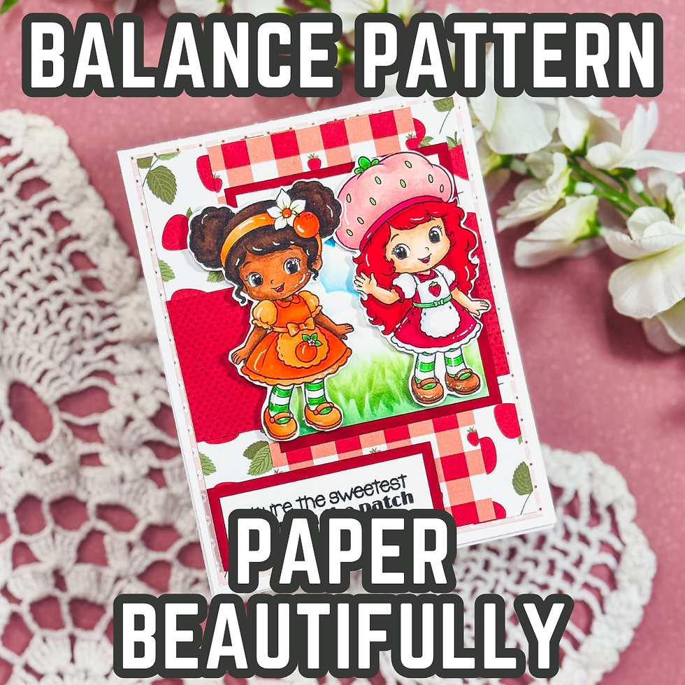
One of the things I enjoy most about cardmaking is that a single project can teach us more than one lesson. We first shared this sweet friendship card as inspiration, but today we're revisiting the design to take a deeper look at one of my favorite cardmaking topics—how bold patterned paper and simple scene building can work together to create a balanced, eye-catching card.
Many cardmakers shy away from using busy patterned papers because they're afraid the background will compete with their stamped images. The good news is that it doesn't have to. With a few thoughtful design choices, you can let colorful papers add personality while still keeping your focal point front and center. In this post, I'll share the design principles behind this friendship card and explain why the combination of layered patterns, soft ink blending, and a simple scene creates a layout that's both cohesive and easy to recreate with supplies from your own stash.
Give Every Layer a Purpose
When a card feels busy, it usually isn't because there are too many layers. More often, it's because the layers are all competing for attention.
For this design, each layer has a different responsibility.
The patterned paper creates energy and introduces the strawberry theme before you even notice the stamped images.
The ink-blended sky and grass establish a simple outdoor setting without demanding attention.
The stamped characters become the obvious focal point because they're the only elements with detailed coloring and strong contrast.
Finally, the sentiment grounds the entire design and gives the eye a place to rest.
When every layer has a purpose, even a colorful card can feel balanced.

Let Your Background Support the Story
I love creating scenes, but I've learned that a scene doesn't always need dozens of stamped elements.
A softly blended sky and grassy hill tell your brain exactly where these characters are without adding visual clutter.
That's one of my favorite design tricks.
Instead of asking yourself, "What else can I add?" try asking, "What does this card actually need?"
Often, a simple background creates far more impact than a complicated one.

Pattern Paper Doesn't Have to Match Perfectly
Many cardmakers hesitate to mix patterned papers because they're worried the prints won't coordinate.
Here's the good news—they don't have to.
Instead of looking for identical themes, pay attention to color.
On this card, the reds, pinks, and soft greens repeat throughout the design. Even though several patterns are visible, the consistent color palette ties everything together.
This is also a great stash-busting tip.
Next time you're digging through your paper collection, don't organize your choices by collection. Spread out papers that share similar colors and see how many unexpected combinations you can create.
You may discover new favorites hiding in your stash.

Create Contrast Instead of Adding More
One design principle I return to again and again is contrast.
Notice how the brightest colors are reserved for the focal images.
The background remains soft.
The sky fades into white.
The grass blends gently upward.
Even the patterned paper sits behind the main panel instead of surrounding the entire card.
All of those little decisions create separation.
Your eye naturally knows exactly where to look first.
That's much more effective than simply adding more embellishments or more layers.

Framing Makes a Big Difference
Another subtle detail on this card is the use of mats around both the focal panel and the sentiment.
Those narrow borders create visual "breathing room."
Without them, the scene would blend into the patterned paper.
Simple mats are one of the easiest ways to make a handmade card feel polished, and they only require a slightly larger piece of cardstock.
If you've ever felt like your focal image gets lost, try adding a thin mat before changing anything else.
You might be surprised how much difference it makes.

Try This Layout with Your Own Supplies
Although this card features adorable strawberry-themed images, the overall design can work with almost anything.
Imagine using:
Snowmen for a holiday card
Sunflowers for a thank-you card
Pumpkins for autumn
Butterflies for encouragement
Cute animals for birthdays
The layout stays the same.
Only the story changes.
That's one of the reasons I love investing in layouts and design principles instead of memorizing individual card recipes. Good design works with every season and every stamp collection.

A Simple Design Can Still Feel Complete
It's easy to believe that adding more techniques automatically makes a better card.
I've found the opposite is often true.
When every design decision has a purpose, your cards begin to feel intentional instead of crowded.
This friendship card combines stamping, alcohol marker coloring, ink blending, stenciling, and patterned paper, but none of those techniques are competing with one another. They're all working together to support the same goal: creating a cheerful card that immediately draws your eye to the sweet friendship scene.
The next time you're designing a card, don't think about what else you can add. Instead, ask yourself what each layer contributes to the finished project.
That simple shift in thinking may completely change the way you build your cards.
Thanks for dropping by today I hope that you found a little spark of creative inspiration with my project today. Wondering what I used in this project? Everything is linked to multiple sources in the thumbnails in the Materials Used section, or in the text below. Compensated affiliate links used when possible.
Supplies Used
Here you will find the list of supplies that I used to create today's card. All supplies are linked to supply sources below. Compensated affiliate links may be used at no cost to you.
Happy Crafting,

Rick Adkins
Affiliate Disclaimer:
Just a friendly reminder, as part of my commitment to transparency, please note that some of the links provided maybe affiliate links. This means that if you make a purchase through these links, I may earn a small commission at no extra cost to you. Your support is truly appreciated!
Additionally, I kindly ask that you always accept the tracking cookie for the affiliate websites. Rest assured, this will not in any way expose your computer to viruses or compromise your information. It's simply necessary for the company to attribute the sale to the affiliate, ensuring creators like myself receive their rightful commissions.
Your trust and support enable me to continue sharing creativity through my email lists, blog, and YouTube channel. Thank you for being a valued part of our crafting community!


Comments