
How to Make Every Layer of Your Handmade Card Work Together

One of the things I noticed while creating this week's cards was that, although every project had a different theme, they all relied on the same design philosophy.
Some featured ink blended stencil backgrounds. Others focused on alcohol marker coloring, patterned paper, scene building, or interactive fun folds. On the surface they looked completely different, but underneath they all followed the same principle:
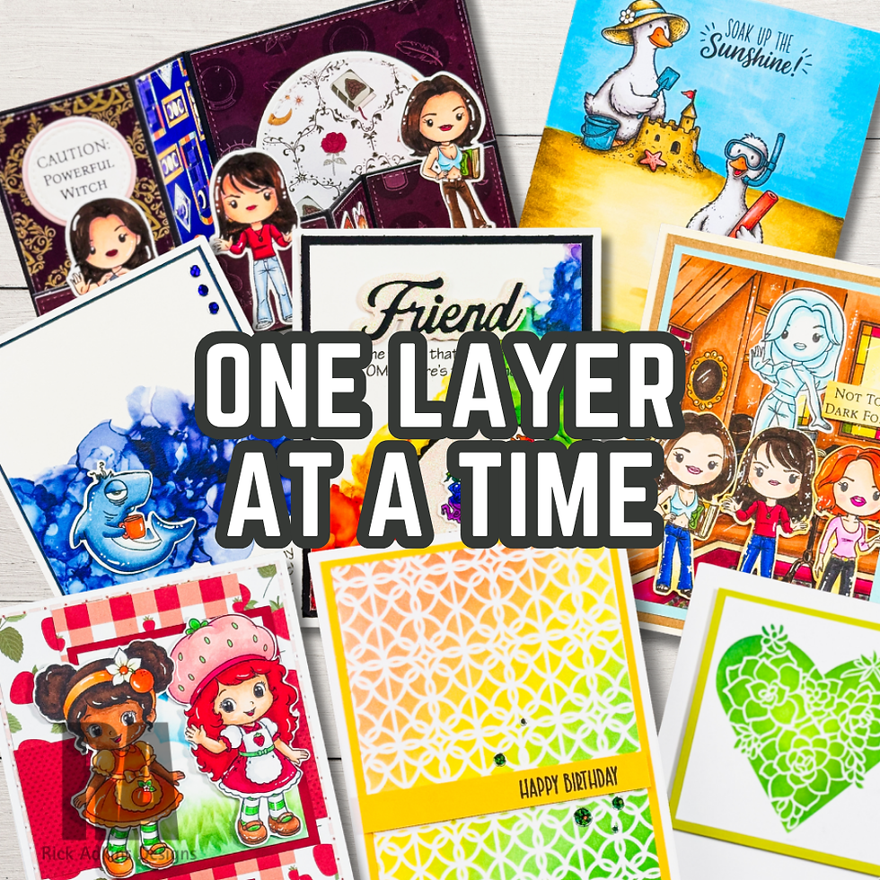
Every layer should have a purpose.
It's a simple idea, but it can make a tremendous difference in how your finished cards look.
Start with a Strong Foundation

Every card begins with a background.
That doesn't necessarily mean an elaborate ink blended sky or an intricate stencil design. Sometimes a simple piece of patterned paper or a lightly stamped background is all you need.
The key is asking what that background is supposed to accomplish.
Does it establish the season?
Does it create depth?
Does it provide contrast for the focal image?
When your background has a clear purpose, it supports the rest of the design instead of competing with it.

Let Your Focal Image Tell the Story
The focal image is usually the first thing someone notices when they look at your card.
Whether you're coloring a whimsical friendship image with alcohol markers or creating a relaxing summer beach scene, your coloring should help reinforce the story you're trying to tell.
Bright colors create playful energy.
Soft colors create calm.
High contrast naturally draws the eye exactly where you want your viewer to look.
Instead of coloring simply because the image needs color, think about how your color choices contribute to the overall feeling of the card.

Pattern Paper Should Support the Design
Patterned paper is one of my favorite supplies because it adds instant interest, but it works best when it's supporting the design instead of overwhelming it.
Throughout this week's projects, patterned paper was used to frame focal images, establish color palettes, and create visual balance.
Rather than asking, "Where can I add another piece of patterned paper?" try asking, "How can patterned paper help my focal image stand out?"
That small change in perspective often results in a cleaner, more cohesive design.

Build Scenes One Layer at a Time
Scene cards can sometimes feel intimidating, especially if you're worried about creating lots of dimension or masking multiple images.
The good news is that effective scene building doesn't have to be complicated.
Many of this week's projects focused on creating simple scenes by letting one element establish the setting while the stamped images carried the story.
A soft ink blended background, a carefully colored image, and thoughtful placement often create all the depth a card needs.
Sometimes less really is more.

Finishing Details Matter
Once the major elements are in place, it's tempting to keep adding embellishments until the card feels "finished."
Instead, pause for a moment.
Ask yourself whether that embellishment improves the design or simply fills empty space.
The same question applies to sentiments, die cuts, gems, and even additional stamping.
Every finishing detail should have a purpose.
Sometimes that purpose is creating balance.
Sometimes it's leading the viewer's eye.
Sometimes it's simply reinforcing the overall theme.
If it doesn't strengthen the design, it may not be necessary.

A Lesson That Worked Across Every Project
Looking back at this week's cards, I realized they all taught the same lesson in different ways.
The stencil cards showed how backgrounds establish atmosphere.
The friendship cards demonstrated how color creates personality.
The scene cards illustrated how simple layers can build depth.
The patterned paper designs reminded us that papers can frame a focal image instead of competing with it.
Even the Halloween square tri-fold card proved that an interactive design works best when each panel contributes to the overall composition.
That's one of the things I enjoy most about cardmaking. The supplies may change. The themes may change. The techniques may change.
Good design principles don't.
The next time you're creating a card, challenge yourself to look at every layer before moving on to the next one.
Instead of asking, "What else can I add?"
Ask yourself, "What purpose does this layer serve?"
You might be surprised how much stronger—and more intentional—your finished cards become.
Thanks for dropping by today I hope that you found a little spark of creative inspiration with my project today. Wondering what I used in this project? Everything is linked to multiple sources in the thumbnails in the Materials Used section, or in the text below. Compensated affiliate links used when possible.
Supplies Used
Here you will find the list of supplies that I used to create today's card. All supplies are linked to supply sources below. Compensated affiliate links may be used at no cost to you.
Happy Crafting,

Rick Adkins
Affiliate Disclaimer:
Just a friendly reminder, as part of my commitment to transparency, please note that some of the links provided maybe affiliate links. This means that if you make a purchase through these links, I may earn a small commission at no extra cost to you. Your support is truly appreciated!
Additionally, I kindly ask that you always accept the tracking cookie for the affiliate websites. Rest assured, this will not in any way expose your computer to viruses or compromise your information. It's simply necessary for the company to attribute the sale to the affiliate, ensuring creators like myself receive their rightful commissions.
Your trust and support enable me to continue sharing creativity through my email lists, blog, and YouTube channel. Thank you for being a valued part of our crafting community!


Comments