
One Layer Floral Cardmaking Tutorial with Ink Blending and Copic Coloring
- Rick Adkins

- Mar 19
- 4 min read
I recently shared a full step-by-step tutorial over on the Unity Stamps blog featuring this soft, one layer floral encouragement card using the Slow Bloom Society Stamp Set. In that post, I walk through the entire process from start to finish. But here, I wanted to slow things down a bit and talk through the why behind the design—those little creative decisions that really make a card come together.
If you’ve ever finished a card and thought, “Okay… but why does this actually work?”—this is exactly the kind of breakdown that helps everything start to click.

Design Decisions & Creative Thinking
Keeping It One Layer (On Purpose)
I’ll be honest—sometimes I add layers out of habit. But for this card, I intentionally kept everything on a single layer to let the stamped image and coloring do all the work.
There’s something really satisfying about pushing yourself to create depth without dimension. It makes you think more about placement, contrast, and balance instead of relying on foam tape or extra pieces.
Vertical Layout for Natural Flow
The tall floral arrangement immediately suggested a vertical design. I placed the image slightly off-center so it feels organic rather than stiff, and that upward movement helps guide your eye right through the card.
I’ve found that when working with florals like this, letting the stems “grow” upward instead of spreading everything out horizontally creates a more elegant, airy look.
Soft, Warm Background Blending
That light ink blending behind the flowers was one of those “last minute but totally worth it” decisions.
At first, the flowers were just stamped and colored on a plain white background—but they felt like they were floating. Adding that soft, warm blend grounded everything and gave the card a gentle, vintage feel.
It’s a small step, but it completely changes how finished the card looks.
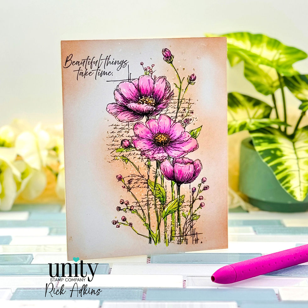
Color Palette: Let the Florals Shine
I kept the palette simple—soft pinks for the flowers and fresh greens for the stems—because I wanted the image itself to be the star.
When I’m working on a one layer card, I try not to compete with too many colors. Fewer colors = more impact.
Details That Make a Difference
The white gel pen highlights and touches of glitter were the finishing pieces. These are easy to skip, but they’re what take the card from “nice” to “polished.”
I like to think of them as the jewelry of the card—just enough to catch the light without stealing the show.

How to Adapt This Idea
One of my favorite things about a design like this is how easy it is to customize using what you already have.
Switch Up the Occasion
Change the sentiment and you’ve got a completely different card:
Birthday: Use brighter, more vibrant colors
Sympathy: Keep everything soft and muted
Thank You: Add a slightly deeper background blend for contrast
Try a Different Layout
If vertical designs aren’t your go-to, try:
Rotating the card to a horizontal layout
Stamping the florals in a corner for a more CAS look
Creating a partial border along one side
Use What You Have
No exact stamp set? No problem.
Any floral image with some height will work
Try watercoloring instead of alcohol markers
Swap ink blending for a light ink wash or even patterned paper behind a masked image
The idea is the same—you’re building a focal point and supporting it with soft color and intentional details.

What I’d Do Differently Next Time
If I made this card again, I’d probably push the contrast just a little more in the flower centers. They look great as-is, but adding a slightly deeper tone there would draw the eye in even more.
That’s something I’m always learning—sometimes a tiny adjustment in contrast can make a big difference in how your focal point stands out.
And honestly, that’s part of the fun. Every card teaches you something for the next one.

Supply Notes
For this card, I used a detailed floral stamp set along with alcohol markers for coloring, a neutral ink for soft background blending, and a few finishing touches like a white gel pen and glitter accents.
If you’re working from your stash, look for:
A floral stamp with open areas for coloring
A light ink for blending backgrounds
Any simple embellishments that add subtle shine
You don’t need a long supply list—just a few well-chosen tools can go a long way.

See the Full Tutorial
If you’d like to read the full step-by-step tutorial using Unity Stamps products, you can find it on their blog here: One Layer Floral Card Tutorial Using the Slow Bloom Society Stamp Set from Unity Stamps

If there’s one thing I hope you take away from this, it’s that simple designs can still feel really special when you’re intentional with your choices.
You don’t need a complicated layout or a lot of supplies—just a beautiful focal image, a bit of color, and those small finishing details that pull everything together.
Give it a try with what you have on hand, and don’t worry about getting it perfect. Sometimes the best cards come from just letting yourself experiment and enjoy the process.
Thanks for dropping by today I hope that you found a little spark of creative inspiration with my project today. Wondering what I used in this project? Everything is linked to multiple sources in the thumbnails in the Materials Used section, or in the text below. Compensated affiliate links used when possible.
Materials Used:
Here you will find the list of supplies that I used to create today's card. All supplies are linked to supply sources below. Compensated affiliate links may be used at no cost to you.
Happy Crafting,

Rick Adkins
Affiliate Disclaimer:
Just a friendly reminder, as part of my commitment to transparency, please note that some of the links provided maybe affiliate links. This means that if you make a purchase through these links, I may earn a small commission at no extra cost to you. Your support is truly appreciated!
Additionally, I kindly ask that you always accept the tracking cookie for the affiliate websites. Rest assured, this will not in any way expose your computer to viruses or compromise your information. It's simply necessary for the company to attribute the sale to the affiliate, ensuring creators like myself receive their rightful commissions.
Your trust and support enable me to continue sharing creativity through my email lists, blog, and YouTube channel. Thank you for being a valued part of our crafting community!


Comments