
One Winter Design: Three Completely Different Looks

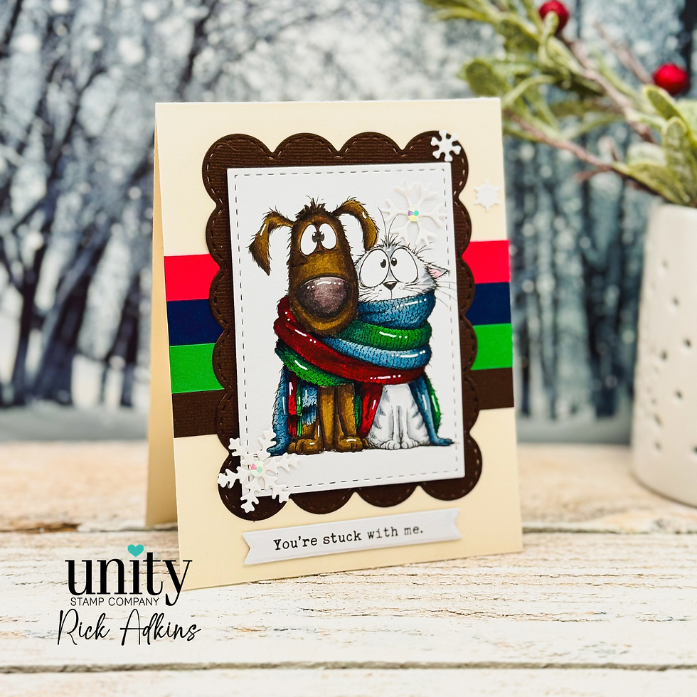
One of my favorite ways to stretch a cardmaking idea is to stop changing the layout and start changing the color story. It is amazing how different the same stamped image can look when you move from cool colors to warm colors, or combine warm and cool shades in a balanced palette. That was the idea behind these three winter cards featuring the Knit Wits Stamp Set from Unity Stamp Company. Rather than creating three completely different designs, I kept the basic card structure consistent and let color do the heavy lifting.

One Winter Design: Three Completely Different Looks
The first thing I wanted to explore was just how much personality color could give this design. All three cards use the same basic ingredients: a stamped and colored focal image, a layered die-cut frame, horizontal cardstock strips, and a few snowflakes. The BIG Scallops & Rectangles {nesting dies} create a decorative frame around the image, while the strips of cardstock add some clean horizontal lines behind it. The result is what I would call a clean and layered card—there are several elements, but each one has a job, so the design doesn't feel overly complicated.

For the first card, I went with a cool color palette to create that classic winter feeling. Blues and icy shades naturally make me think of cold weather, snow, and crisp winter days. For the second card, I intentionally moved in the opposite direction with a warm color palette. Nothing about the stamped image or layout changed, but suddenly the card had a completely different personality. The third card combines warm and cool colors, which is one of my favorite approaches when I want contrast without letting one color family take over. This is a great reminder that when you're coloring stamped images, you don't have to choose colors simply because they seem obvious for the season.

The Design Lesson: Let Color Do Some of the Work
This project is also a good exercise in getting more mileage from the supplies you already own. If you have a favorite stamp set and a card layout that works, you don't necessarily need a new design every time you sit down to create. Try making the same card in a cool palette, then a warm palette, and finally a combination of the two. You may discover that your stamps have far more possibilities than you realized. When choosing your colors, I also like to repeat a few shades throughout the card. Pulling a color from the stamped image into the cardstock strips or frame helps everything feel connected rather than looking like separate pieces placed together.

The Snowflake Dies are another example of keeping embellishment intentional. I didn't need to fill every open space with snowflakes. A few strategically placed die cuts are enough to reinforce the winter theme while allowing the colored image to remain the star of the card. If you don't have snowflake dies, this same idea can work with any small seasonal die cuts you already have—or you can leave them off entirely. The important design principle is to use small details to support the focal point, not compete with it.
The beauty of this approach is that you can easily adapt it to your own stash. Don't have the BIG Scallops & Rectangles {nesting dies}? Try a stitched rectangle, a simple mat, or even a hand-cut layer. Instead of cardstock strips, use patterned paper scraps, strips from your scrap bin, or ink-blended cardstock. And if you're using a different coloring medium, the same color-palette exercise still works. Whether you reach for alcohol markers, colored pencils, or another medium, start by deciding whether you want your finished card to feel cool, warm, or balanced between the two.

I especially like projects like this because they take some of the pressure out of cardmaking. You don't have to come up with three brilliant designs to make three different cards. Start with one good design, then experiment with color, layering, and small details. These three winter cards are proof that a familiar layout can take on a completely new look simply by changing the palette. So the next time you're stuck for an idea, pull out a stamp set you already love and ask yourself a different question: What would this card look like in a completely different color story? You might be surprised by what you create.
Thanks for dropping by today I hope that you found a little spark of creative inspiration with my project today. Wondering what I used in this project? Everything is linked to multiple sources in the thumbnails in the Materials Used section, or in the text below. Compensated affiliate links used when possible.
Supplies Used
Here you will find the list of supplies that I used to create today's card. All supplies are linked to supply sources below. Compensated affiliate links may be used at no cost to you.
Happy Crafting,

Rick Adkins
Affiliate Disclaimer:
This post contains affiliate links. If you choose to shop through these links, I may earn a small commission at no extra cost to you. Thank you so much for supporting my business!


Comments