
Squawk Talk Stamp Set Tutorial: Stenciled Backgrounds Made Easy with The Rabbit Hole Designs
- Rick Adkins

- Feb 28
- 4 min read
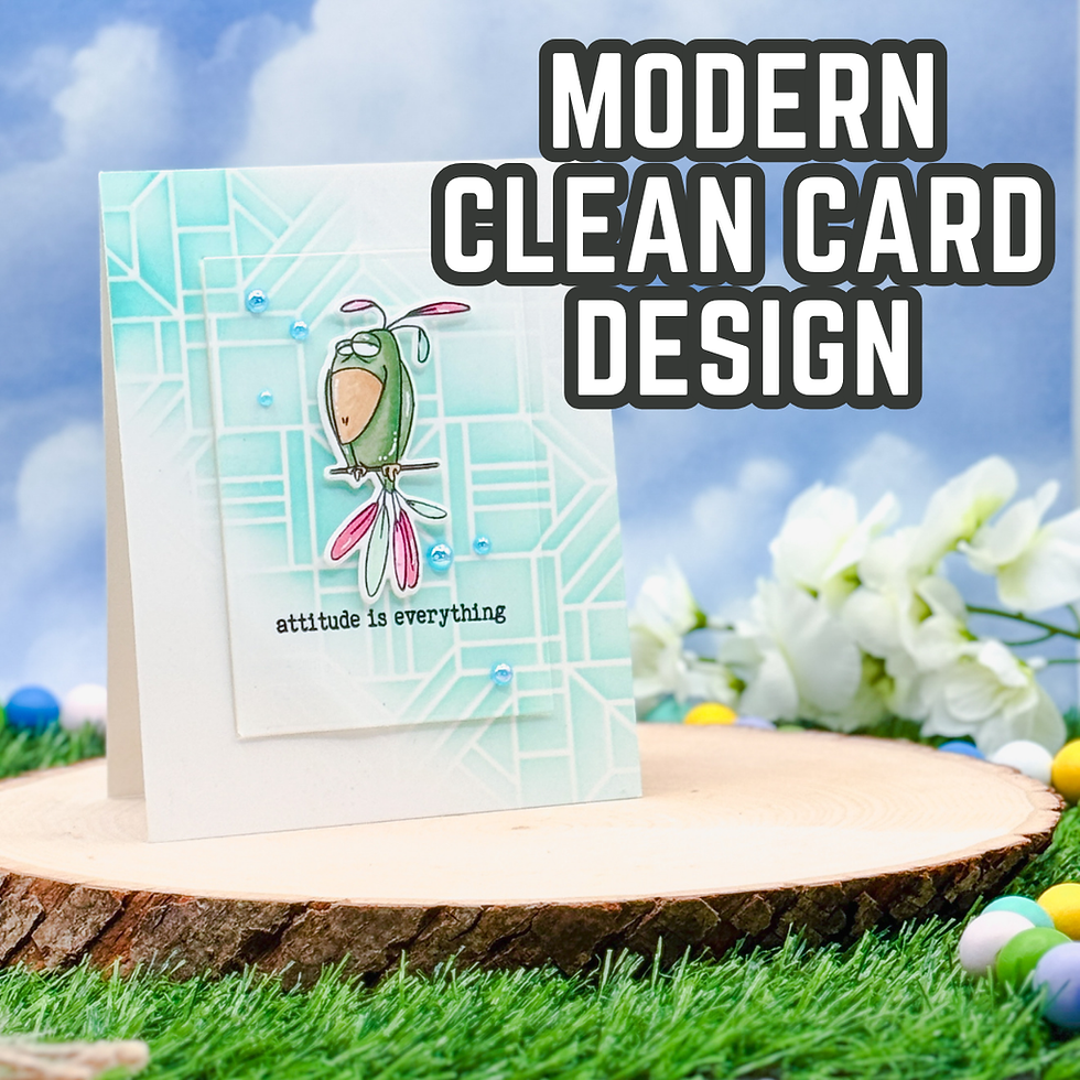
Sometimes a card just needs a little attitude. I don’t always reach for bold sentiments, but when I do, I love pairing them with a clean and simple card design that lets the personality shine. That’s exactly what I had in mind when I pulled out the Squawk Talk Stamp Set & Dies Bundle from The Rabbit Hole Designs. That slightly unimpressed bird? Perfect. The “attitude is everything” sentiment? Even better.
Instead of building something busy, I focused on strong contrast, intentional white space, and one eye-catching background technique that feels impressive but is actually very approachable.
Why a Stenciled Background Works So Well Here
When you’re creating a sassy card, the image and sentiment usually carry the personality. That means the background should support—not compete.
I used the Modern Luxury 6x6 Stencil from The Rabbit Hole Designs with a soft ink blending technique using Waterfall Ink from PinkFresh Studio. The geometric pattern adds structure and a modern feel, but by keeping the blending concentrated toward one side and fading it out, the design stays light and airy.
This is one of my favorite clean and simple cardmaking strategies:
Keep pattern on one side
Allow white space to breathe
Anchor your focal point slightly off-center
That subtle asymmetry creates visual interest without overwhelming the eye. It’s especially helpful if you’re working with a bold stamped image.
If you don’t have this exact stencil, look for anything geometric in your stash—grids, stripes, abstract lines, even subtle florals. The key isn’t the specific pattern. It’s controlling the ink blending so it doesn’t overpower your focal point.

Keeping the Focal Image Strong and Crisp
For the bird image, I stamped in Tuxedo Black Ink so I could use alcohol markers without worrying about smearing. I colored with Ohuhu Alcohol Markers and kept the palette simple: green, a pop of pink, and warm yellow for the beak.
When you’re creating a handmade card with alcohol marker coloring, restraint matters. Too many colors can pull attention away from the design. Here, the limited palette keeps the image cohesive and lets that pink detail feel intentional instead of random.
For the sentiment, I switched to Versafine Onyx Black Ink. I love doing this when I want the words to feel grounded and bold. The deeper black subtly separates the sentiment from the image, even though both are stamped in black ink.
That small choice makes a big difference in the finished look.

Adding Dimension Without Clutter
Clean and simple doesn’t have to mean flat.
I used the Diamond District Layering/Nesting Dies from The Rabbit Hole Designs to create a subtle mat behind the focal panel. That extra layer frames the design and draws the eye inward without adding visual noise.
One of the easiest ways to elevate a stamped card is to:
Add one layered panel
Pop up your focal image with foam adhesive
Keep embellishments minimal and intentional
Those few Razzlebery Bubbles embellishments echo the background color and guide the eye in a gentle diagonal. That’s something I think about often—embellishments shouldn’t just fill space; they should move your eye across the card.

Why This Layout Feels Balanced
If you look closely, everything works in a triangle:
The bird sits slightly above center
The sentiment anchors below
The embellishments create movement outward
That triangle keeps the design stable, even with the playful image.
When you’re building your own clean and simple card, try thinking in shapes instead of just placement. Triangles, diagonals, and thirds can instantly make your layout feel intentional instead of accidental.

How to Adapt This Idea with Your Own Supplies
You absolutely do not need these exact products to recreate this feel.
Here are a few ways you can adapt this idea:
Different Image: Swap in any character stamp with personality. Funny florals, critters, or even bold word stamps work beautifully.
Different Background: Use embossing folders instead of stencils for texture. Lightly ink over the raised areas for a similar soft effect.
No Alcohol Markers? Try colored pencils for a softer look or watercolor for a looser feel.
No Nesting Dies? Trim a slightly larger rectangle with your paper trimmer for the same layered effect.
The heart of this design isn’t the specific products—it’s the balance of bold focal image + controlled background + intentional white space.
Once you understand that formula, you can recreate it again and again with whatever you already have.

Final Thoughts
I love projects like this because they remind me that stamping techniques don’t have to be complicated to be effective. A little ink blending, thoughtful alcohol marker coloring, and smart layering can create a handmade card that feels polished and expressive.
If you’ve been wanting to experiment with stenciled backgrounds but weren’t sure how to keep them clean and simple, this is your sign to try. Start light. Blend softly. Let your focal image shine.
And don’t be afraid to add a little attitude while you’re at it.
Thanks for dropping by today I hope that you found a little spark of creative inspiration with my project today. Wondering what I used in this project? Everything is linked to multiple sources in the thumbnails in the Materials Used section, or in the text below. Compensated affiliate links used when possible.
Materials Used:
Here you will find the list of supplies that I used to create today's card. All supplies are linked to supply sources below. Compensated affiliate links may be used at no cost to you.
Happy Crafting,

Rick Adkins
Affiliate Disclaimer:
Just a friendly reminder, as part of my commitment to transparency, please note that some of the links provided maybe affiliate links. This means that if you make a purchase through these links, I may earn a small commission at no extra cost to you. Your support is truly appreciated!
Additionally, I kindly ask that you always accept the tracking cookie for the affiliate websites. Rest assured, this will not in any way expose your computer to viruses or compromise your information. It's simply necessary for the company to attribute the sale to the affiliate, ensuring creators like myself receive their rightful commissions.
Your trust and support enable me to continue sharing creativity through my email lists, blog, and YouTube channel. Thank you for being a valued part of our crafting community!


Comments