
The Best Design Decision Happens Before You Add Embellishments

Updated: Aug 3
Have you ever finished a card and felt like something just wasn't quite right? Maybe you added another embellishment, another die cut, or another splash of color, hoping it would pull everything together. Sometimes those additions help—but often, the real solution starts much earlier in the design process.
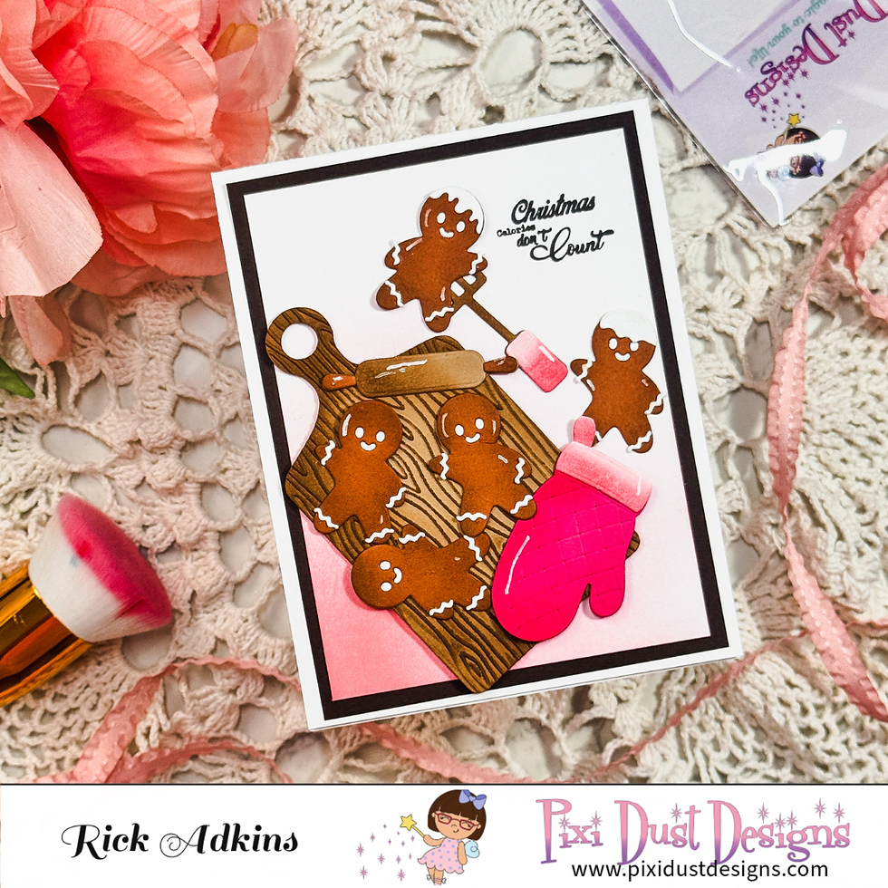
As I worked on several different card projects recently, I noticed they all had one important thing in common. Even though the themes ranged from playful Halloween treats to a cozy Christmas card and a sweet friendship design, they all relied on the same design principle: one strong focal point supported by intentional design choices.
That simple decision made every card feel balanced, inviting, and easy to enjoy.

Start with the Story
Before I choose patterned paper, embellishments, or even a sentiment, I ask myself one question:
What do I want people to notice first?
The answer becomes the focal point of the card. It might be a stamped image, a die-cut element, or a meaningful sentiment. Once that decision is made, every other design choice becomes much easier because each layer has a purpose.
Instead of competing for attention, the background, colors, and embellishments work together to highlight the main feature.

Less Competition Creates More Impact
It's easy to think that adding more details automatically makes a card more interesting. In reality, too many competing elements can make it difficult for the eye to know where to look.
One of the easiest ways to improve a handmade card is to simplify the supporting elements. A patterned paper can add texture without becoming the star of the show. Ink blending can create depth while still allowing the focal image to shine. Even embellishments work best when they guide the eye instead of distracting from it.
When every element supports the focal point, the entire design feels more polished.
Color with Purpose
Color is another powerful way to reinforce your focal point.
Whether I'm coloring with alcohol markers or selecting patterned papers, I try to repeat colors throughout the design while keeping the overall palette limited. Repeating colors creates unity, while a restrained palette keeps the focal image from getting lost.
You don't need dozens of colors to create an eye-catching card. Often, a handful of coordinating shades creates a cleaner, more professional look.

White Space Is Part of the Design
One lesson I've learned over the years is that empty space isn't wasted space.
White space gives the eye a place to rest and naturally draws attention to the most important part of the card. It helps create balance and prevents the design from feeling crowded.
Whenever I'm tempted to fill every open area, I remind myself that sometimes the strongest design decision is choosing what to leave out.

Try This on Your Next Card
The next time you sit down to create, pause before reaching for your embellishments.
Ask yourself:
What is my focal point?
Does every element support that focal point?
Is there anything I can remove instead of add?
Will someone's eye naturally know where to look first?
Those four simple questions can completely change the way you approach card design.

Great cards aren't necessarily the ones with the most techniques or supplies. They're the ones where every design choice works together to tell a clear visual story.
That's a lesson I'll keep coming back to, no matter the season, stamp set, or style of card I'm creating.
Thanks for dropping by today I hope that you found a little spark of creative inspiration with my project today. Wondering what I used in this project? Everything is linked to multiple sources in the thumbnails in the Materials Used section, or in the text below. Compensated affiliate links used when possible.
Supplies Used
Here you will find the list of supplies that I used to create today's card. All supplies are linked to supply sources below. Compensated affiliate links may be used at no cost to you.
Happy Crafting,

Rick Adkins
Affiliate Disclaimer:
Just a friendly reminder, as part of my commitment to transparency, please note that some of the links provided maybe affiliate links. This means that if you make a purchase through these links, I may earn a small commission at no extra cost to you. Your support is truly appreciated!
Additionally, I kindly ask that you always accept the tracking cookie for the affiliate websites. Rest assured, this will not in any way expose your computer to viruses or compromise your information. It's simply necessary for the company to attribute the sale to the affiliate, ensuring creators like myself receive their rightful commissions.
Your trust and support enable me to continue sharing creativity through my email lists, blog, and YouTube channel. Thank you for being a valued part of our crafting community!


Comments