
Float Into Summer with a Clean and Simple Relaxation Card
- Rick Adkins

- Jul 9
- 5 min read
I recently shared a full tutorial on the Unity Stamp Company blog featuring the Cool Goose Summer Stamp Set, part of the July 2026 Whit-Kit Card Kit. In that post, I focused on the featured products and the overall project. Here on my blog, I wanted to take a different approach by sharing some of the design decisions behind the card, why I kept the layout so simple, and a few ideas for making this style work with supplies you may already have in your craft room.
One of my favorite things about creating clean and simple cards is that every design choice matters. When there are fewer elements competing for attention, the focal image, color choices, and placement all work together to tell the story. That's exactly what I was aiming for with this playful summer card.

Why I Chose Such a Simple Layout
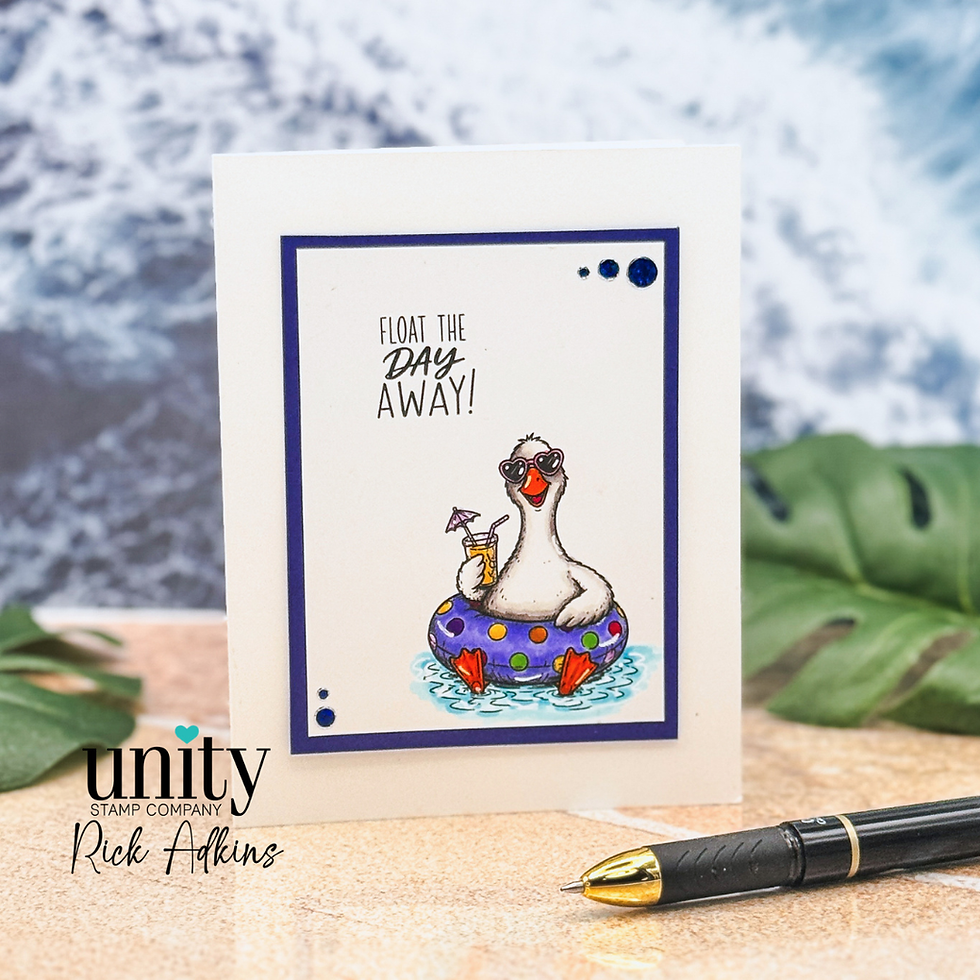
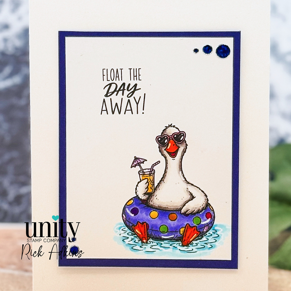
Whenever I have a stamped image with lots of personality, I try to resist the urge to fill every bit of empty space. This goose already has plenty of character—from the sunglasses to the floating inner tube and tropical drink—so adding busy backgrounds or extra embellishments would have taken away from what makes the image so much fun.
Instead, I centered everything around the illustration and gave it plenty of breathing room. The sentiment sits above the image, naturally leading your eye down to the focal point, while a thin colored mat frames the design without making it feel heavy.
I've learned over the years that white space isn't something to be afraid of. In fact, it often gives a card a more polished, professional appearance.
Keeping the Color Palette Focused
Another design decision I made was limiting the color palette.
The bright blue inner tube became the anchor color for the entire card. Once I chose that shade, it made sense to repeat it in the mat layer and embellishments. Repeating a single color throughout a design is one of the easiest ways to create a cohesive look, even if you're using several other accent colors in your coloring.
I also kept the water subtle rather than making it the brightest part of the card. That helps keep the goose as the star of the scene while still giving the image a sense of place.
Whenever I'm coloring playful images, I like to ask myself one simple question:
"Where do I want someone's eye to go first?"
Answering that question usually helps me decide where bold color belongs—and where it doesn't.

Sometimes Less Really Is More
I'll admit that I briefly considered adding a patterned paper background.
I even pulled out a few options from my stash before laying them beside the finished focal panel.
None of them improved the design.
That's one of those moments I think every cardmaker experiences. We assume adding another layer will make a card feel "finished," but sometimes the opposite is true. Once I removed the extra papers, everything felt lighter and more balanced.
Those little moments of editing are just as important as the creative decisions we make at the beginning of a project.
How You Can Make This Design Your Own
One of the reasons I enjoy layouts like this is how easy they are to adapt.
Here are a few ideas to try:
Swap the relaxing summer sentiment for a birthday or encouragement greeting to completely change the occasion.
Turn the design into a landscape card instead of portrait to give yourself more room for a longer sentiment.
Use any playful stamped character from your collection and let it become the focal point. Animals, people, or even food-themed images would work beautifully with this style.
If you enjoy patterned paper, try using it only as a narrow mat or border instead of covering the entire background. You'll still add color and interest without taking attention away from the stamped image.
These kinds of adaptations are a great way to stretch your supplies while discovering layouts you'll come back to again and again.
One Thing I'd Change Next Time
If I were making this card again, I might experiment with adding just a touch more shading around the bottom of the image to ground it a little more firmly on the card front.
Not because I think the original needs it—but because I enjoy revisiting designs to see what a small change might accomplish.
That's something I encourage every cardmaker to do.
Your first version doesn't have to be your last version. Sometimes your favorite discoveries happen when you revisit a project a few weeks later with fresh eyes.

A Few Supply Thoughts
For a project like this, you don't need a large collection of specialty supplies. A favorite stamped image, smooth cardstock, alcohol markers, a coordinating sentiment, and a few embellishments are enough to create a card that feels polished without becoming complicated.
If you're shopping for new supplies, I'll include affiliate links below to the items I used whenever possible. They help support my blog at no additional cost to you, and I truly appreciate your support.
Looking for the Full Tutorial?
If you'd like to see the full product-focused tutorial featuring the Cool Goose Summer Stamp Set, be sure to visit the Unity Stamp Company blog. That's where you'll find all of the project details and a closer look at the featured stamp set.

Final Thoughts
I hope this card encourages you to embrace simple layouts a little more often. It's easy to think every card needs lots of layers, techniques, or embellishments, but some of the most memorable designs rely on thoughtful placement and a clear focal point instead.
Don't worry about making your card look exactly like mine. Use the stamps, colors, and supplies you already own, trust your creative instincts, and enjoy the process. Every card you create teaches you something new—and that's one of the best parts of this hobby.
Thanks so much for stopping by today, and I hope this project inspires you to carve out a little creative time and float the day away in your craft room!
Wondering what I used in this project? Everything is linked to multiple sources in the thumbnails in the Materials Used section, or in the text below. Compensated affiliate links used when possible.
Supplies Used
Here you will find the list of supplies that I used to create today's card. All supplies are linked to supply sources below. Compensated affiliate links may be used at no cost to you.
Happy Crafting,

Rick Adkins
Affiliate Disclaimer:
Just a friendly reminder, as part of my commitment to transparency, please note that some of the links provided maybe affiliate links. This means that if you make a purchase through these links, I may earn a small commission at no extra cost to you. Your support is truly appreciated!
Additionally, I kindly ask that you always accept the tracking cookie for the affiliate websites. Rest assured, this will not in any way expose your computer to viruses or compromise your information. It's simply necessary for the company to attribute the sale to the affiliate, ensuring creators like myself receive their rightful commissions.
Your trust and support enable me to continue sharing creativity through my email lists, blog, and YouTube channel. Thank you for being a valued part of our crafting community!


Comments