
How I Create Cohesive Card Designs Using Multiple Products

One of the questions I hear most often from cardmakers is how to make a card feel coordinated when using products from different sets. It's easy to fall in love with a stencil, a die set, and a stamp set individually, but bringing them together into a single design can sometimes feel overwhelming.
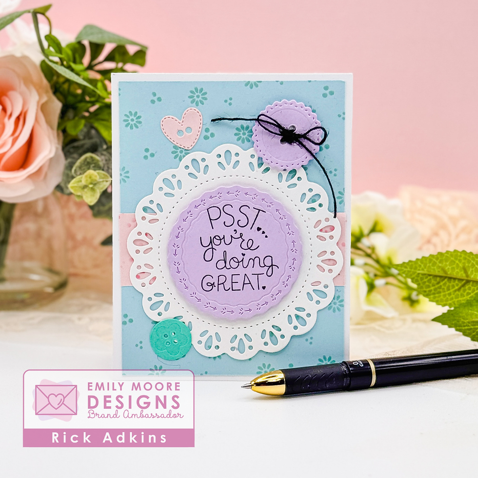
For this encouragement card, I wanted to focus on creating a clean and layered design that feels intentional from top to bottom. The soft aqua and lavender color palette, layered circles, and subtle patterned background all work together to create a project that looks polished without becoming complicated. I walk through the creative process in today's video, but I also wanted to share some of the design thinking behind the project here because understanding the "why" can often be more helpful than simply following the steps.

The Real Secret to Cohesive Card Design
When cardmakers struggle with creating cohesive designs, the problem usually isn't the products themselves. More often, it's that there isn't enough visual repetition throughout the card.
As I designed this card, I focused on repeating three key elements:
Shape
Color
Pattern
The circular theme appears throughout the entire design. The focal point is built around layered circles, the die-cut doily reinforces that shape, and even the button embellishments continue the circular motif. When a shape appears multiple times, it creates a visual connection that naturally ties everything together.
Color repetition works the same way. Instead of introducing several competing colors, I stayed with soft aqua and lavender tones. Repeating those colors in the background, focal layers, and embellishments creates harmony and helps the eye move comfortably around the card.
The subtle stenciled pattern serves as a supporting element rather than a competing focal point. This is an important distinction that many cardmakers overlook.

Why Ink Blending Works So Well for Layered Cards
One of my favorite ways to add interest without adding clutter is through ink blending.
The Dainty Dots Stencils allowed me to create both the background panel and a coordinating accent panel. Using the same stencil pattern in multiple places creates continuity while still allowing each section of the card to have its own purpose.
A common mistake I see is using too many competing patterns or textures on one project. While there's nothing wrong with bold designs, it can sometimes make a card feel busy rather than balanced.
Using a subtle stenciled pattern gives you texture and visual interest without overwhelming the focal point. This is especially effective for encouragement cards where the sentiment should remain the star of the design.
Choosing Products That Work Together
One thing I appreciated while creating this card is how naturally the products complement each other.
The Doilies & Daisies Circle Dies create a beautiful decorative frame around the sentiment, adding detail without requiring additional embellishments. The Decorative Circle Dies help build dimension and draw attention to the center of the card, while the Buttons Dies provide small accents that reinforce the circular theme.
The Gentle Reminders Stamp Set was a perfect choice for this project because the sentiment carries the emotional focus of the card. Encouragement cards often don't need a lot of extra decoration when the message itself is strong.
I also finished the back of the card using the From the Crafty Corner Stamp Set. Small details like this are easy to overlook, but they help create a polished finished project that feels complete.

How to Adapt This Idea with Supplies You Already Own
The good news is that this design concept isn't dependent on having these exact products.
If you have circle dies from another collection, use those. If you prefer hearts, squares, or flowers, the same design principles still apply.
The important takeaway is not the specific shape—it's the repetition of the shape.
The same goes for color. You could recreate this card using bright colors, earth tones, holiday colors, or even a monochromatic palette. As long as you're repeating colors intentionally throughout the design, you'll create a stronger sense of unity.
For beginners, I recommend limiting yourself to:
One primary shape
Two or three colors
One background pattern
Those simple constraints actually make design decisions easier and often lead to more successful cards.

Why Encouragement Cards Are Worth Keeping on Hand
Encouragement cards are some of my favorite cards to create because they're useful year-round.
Unlike holiday-specific cards, encouragement cards can be sent for countless reasons—a friend facing a challenge, a family member needing support, or simply someone who could use a reminder that they're doing a great job.
The soft colors and uplifting sentiment on this card help reinforce that message, creating a project that feels warm, thoughtful, and sincere.
Final Thoughts
If you've ever looked at your craft supplies and wondered how to make everything work together, I hope this project encourages you to focus less on finding perfectly matching products and more on creating visual connections through shape, color, and pattern.
Those small design choices can make a huge difference in the finished result.
Don't worry about making every element perfect. Experiment, try different combinations, and pay attention to the elements you're repeating throughout your design. You may be surprised how quickly your cards start feeling more cohesive and intentional.

And if you haven't watched the video yet, be sure to check it out below. Seeing the card come together visually can make these design concepts even easier to apply to your own projects.
Watch the Video
If you're a visual learner, this will help you see how all of these design decisions come together in a finished card.
If you have problems watching the video here on my blog you can always watch it on my YouTube Channel by Clicking Here!
(Wondering what I used in this video? Everything is linked to multiple sources in the thumbnails at the end of this post, or in the text below. Use Code RICK10 to save 10% on your order at Emily Moore Designs. Compensated affiliate links used when possible). As always I appreciate your support of my videos!
Supplies Used
Here you will find the list of supplies that I used to create today's card. All supplies are linked to supply sources below. Compensated affiliate links may be used at no cost to you.
Happy Crafting,

Rick Adkins
Affiliate Disclaimer:
Just a friendly reminder, as part of my commitment to transparency, please note that some of the links provided maybe affiliate links. This means that if you make a purchase through these links, I may earn a small commission at no extra cost to you. Your support is truly appreciated!
Additionally, I kindly ask that you always accept the tracking cookie for the affiliate websites. Rest assured, this will not in any way expose your computer to viruses or compromise your information. It's simply necessary for the company to attribute the sale to the affiliate, ensuring creators like myself receive their rightful commissions.
Your trust and support enable me to continue sharing creativity through my email lists, blog, and YouTube channel. Thank you for being a valued part of our crafting community!


Comments