
How to Combine Pattern Paper and Stamping for Elegant Encouragement Cards
- Rick Adkins

- 49 minutes ago
- 4 min read
Have you ever looked at a beautiful piece of pattern paper and wondered how to use it without covering up all the details? I find that balancing patterned paper with a detailed stamped image can sometimes feel tricky. Too much pattern can compete with the focal point, while too little can leave a card feeling unfinished.
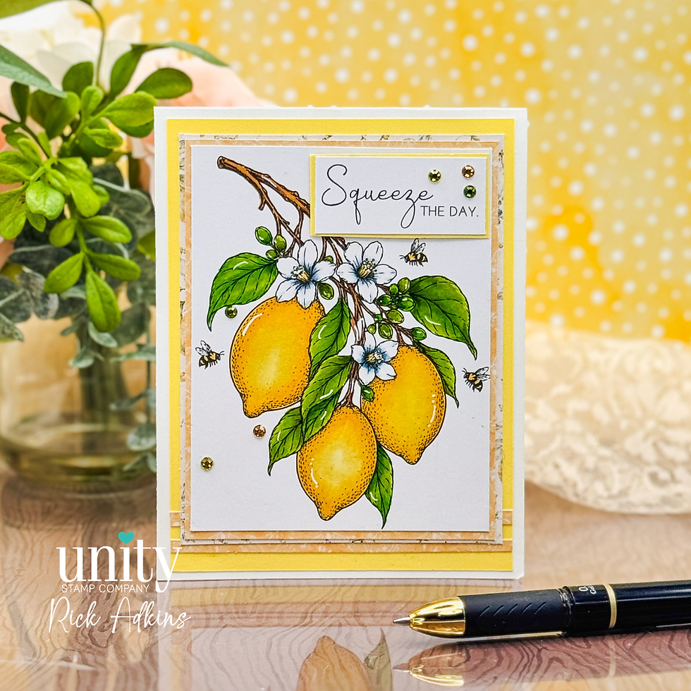
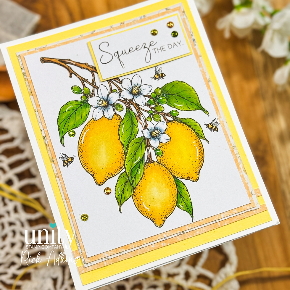
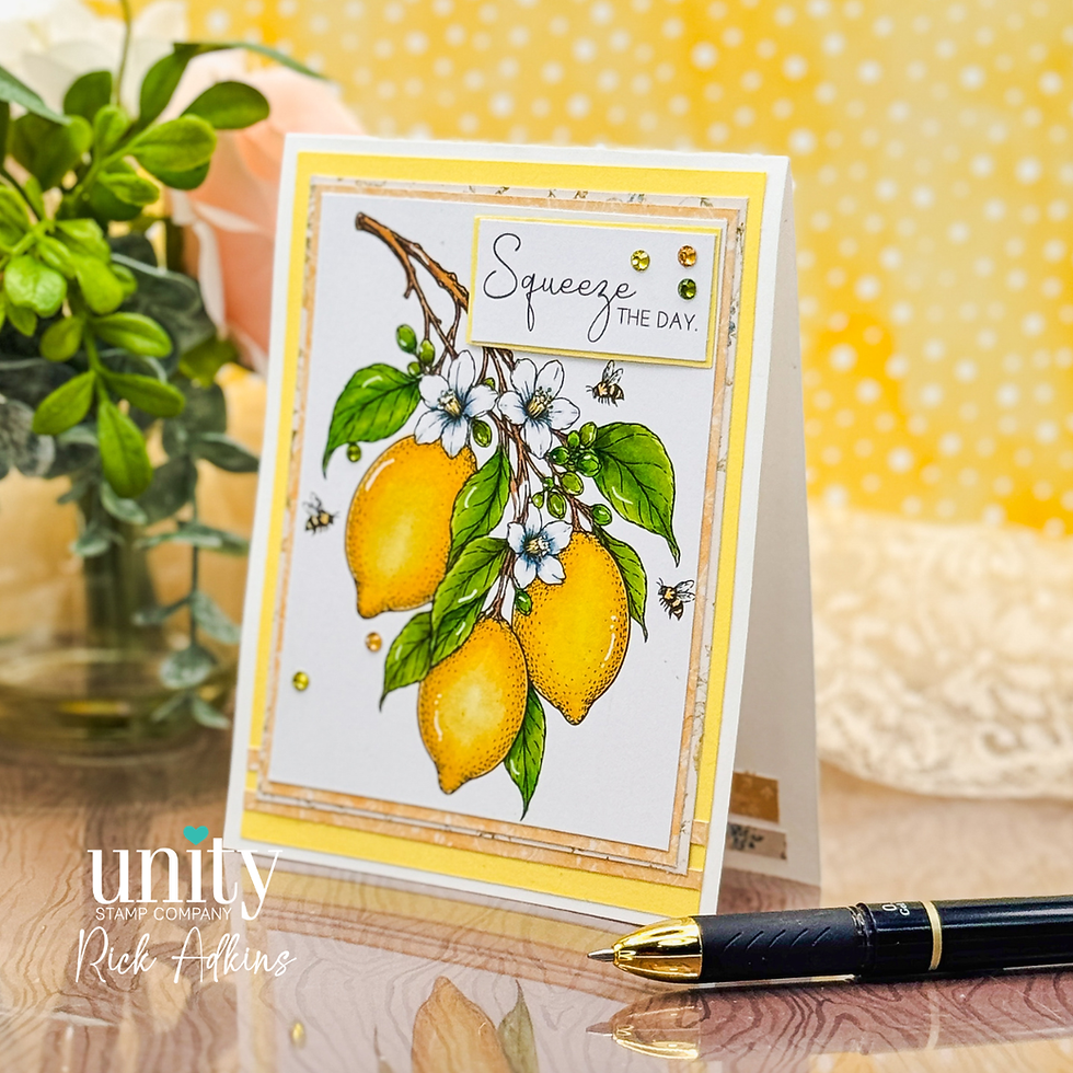
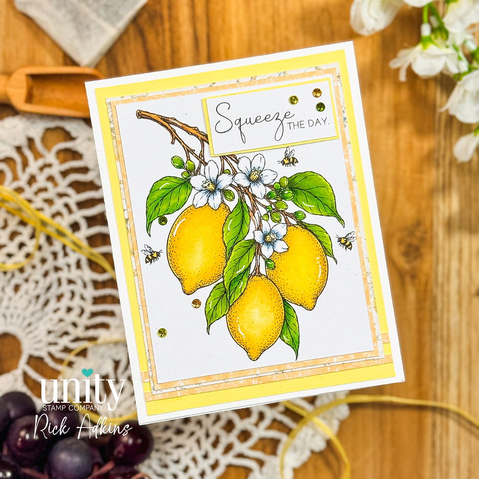
For today's encouragement card, I wanted to create something bright, uplifting, and easy to recreate while still allowing the focal image to shine. Using the You're the Zest Stamp Set and the Limoncello Garden {Paper Pack} from Unity Stamp Company gave me the perfect combination of detailed artwork and soft supporting patterns. The result is a card that feels layered and polished without becoming overly complicated.

Let the Focal Image Do the Heavy Lifting
One of my favorite cardmaking principles is allowing a strong focal image to carry most of the design. When a stamp already includes beautiful details—like florals, leaves, and fruit—you don't need a lot of extra elements competing for attention.
The lemon branch image immediately became the star of this card. Instead of adding multiple focal elements, I chose to build around it with simple layers and subtle framing. This creates a cleaner look while still providing plenty of visual interest.
I think many cardmakers underestimate how effective a single well-colored image can be. Sometimes the best design choice is knowing when to stop adding more.

Why Pattern Paper Works Best in Small Doses
Pattern paper can completely transform a card design, but it doesn't always have to cover large sections of the card front.
For this project, I used the patterned paper almost like a decorative frame. Thin borders of pattern paper create separation between the focal panel and the card base while adding texture and softness. This approach allows the paper to contribute to the overall design without competing with the stamped image.
If you've ever struggled to use busy patterns, try cutting them into narrow mats or accent strips. It's a great way to stretch your supplies while keeping your focal point front and center.
This same concept works with almost any paper collection in your stash, making it an easy design strategy to revisit again and again.
Creating Bright, Cheerful Color Without Overcomplicating It
When I think of encouragement cards, I naturally gravitate toward bright colors. Yellow has a way of instantly communicating warmth, positivity, and optimism.
The lemons provided the perfect opportunity to build a cheerful color palette while keeping the coloring approachable. Rather than trying to incorporate a wide range of colors, I focused on a simple combination of yellow, green, and soft floral accents.
Limiting your color palette often creates a more cohesive finished project. It's also one of the easiest ways to reduce decision fatigue when you're sitting down to craft.
For beginner and intermediate colorists, this type of image is ideal because it offers plenty of opportunities to practice simple shading without feeling overwhelming.
The Power of Small Details
One of the things I enjoy most about finishing a card is adding those final touches that bring everything together.
A few highlights from a white gel pen help create the appearance of reflected light on the lemons and leaves. Adding subtle sparkle with a wink of stella clear brush pen introduces another layer of interest that catches the eye when the card is viewed in person.
These details may seem small, but they're often what elevate a card from looking finished to feeling polished.
The key is moderation. A little shimmer and a few strategic highlights usually have more impact than covering every surface with embellishment.
How to Make This Design Your Own
What I love about this layout is how adaptable it is.
If citrus images aren't your style, the same design concept works beautifully with florals, seasonal images, or even larger sentiment stamps. The combination of a focal image, simple layered mats, and small pattern paper accents creates a framework that can be customized for almost any occasion.
You could easily turn this into a birthday card, thinking-of-you card, thank-you card, or friendship card simply by changing the sentiment and color palette.
This is also a wonderful layout for using supplies you already own. Look through your stash for larger focal images and coordinating papers, then experiment with framing the image using narrow patterned paper borders instead of large background panels.
Final Thoughts
One of the most valuable lessons I've learned as a cardmaker is that elegant designs don't have to be complicated. Often, a strong focal image, thoughtful color choices, and a few supporting layers are all you need to create something beautiful.
This encouragement card is a great reminder that pattern paper and stamping can work together beautifully when each element is given room to shine. Whether you're reaching for the You're the Zest Stamp Set and the Limoncello Garden {Paper Pack} or adapting the idea with supplies from your own collection, I hope this project encourages you to look at your patterned papers in a new way and experiment with simple layered designs.
Sometimes the most impactful cards begin with the simplest ideas.
Thanks for dropping by today I hope that you found a little spark of creative inspiration with my project today. Wondering what I used in this project? Everything is linked to multiple sources in the thumbnails in the Materials Used section, or in the text below. Compensated affiliate links used when possible.
Supplies Used
Here you will find the list of supplies that I used to create today's card. All supplies are linked to supply sources below. Compensated affiliate links may be used at no cost to you.
Happy Crafting,

Rick Adkins
Affiliate Disclaimer:
Just a friendly reminder, as part of my commitment to transparency, please note that some of the links provided maybe affiliate links. This means that if you make a purchase through these links, I may earn a small commission at no extra cost to you. Your support is truly appreciated!
Additionally, I kindly ask that you always accept the tracking cookie for the affiliate websites. Rest assured, this will not in any way expose your computer to viruses or compromise your information. It's simply necessary for the company to attribute the sale to the affiliate, ensuring creators like myself receive their rightful commissions.
Your trust and support enable me to continue sharing creativity through my email lists, blog, and YouTube channel. Thank you for being a valued part of our crafting community!


Comments