
How to Use Stencils for Depth: Clean and Simple Floral & Rainbow Card Designs
- Rick Adkins

- Mar 21
- 4 min read
Sometimes the challenge in cardmaking isn’t what to use—it’s how to make what you already have feel fresh and interesting. I wanted to explore how stencils can do more than just add a background… how they can actually create depth and guide your entire design.
For today’s project, I created two clean and simple handmade cards using stencil techniques in completely different ways. One leans soft and floral, while the other goes bold with a rainbow clover design. I walk through the process in the video, but here I want to dig into the why behind the choices so you can take these ideas and make them your own.

Why Stencils Are Perfect for Creating Depth
When most people think of stencils, they think “background.” But one of the easiest ways to elevate your cards is to start thinking of stencils as design builders instead.
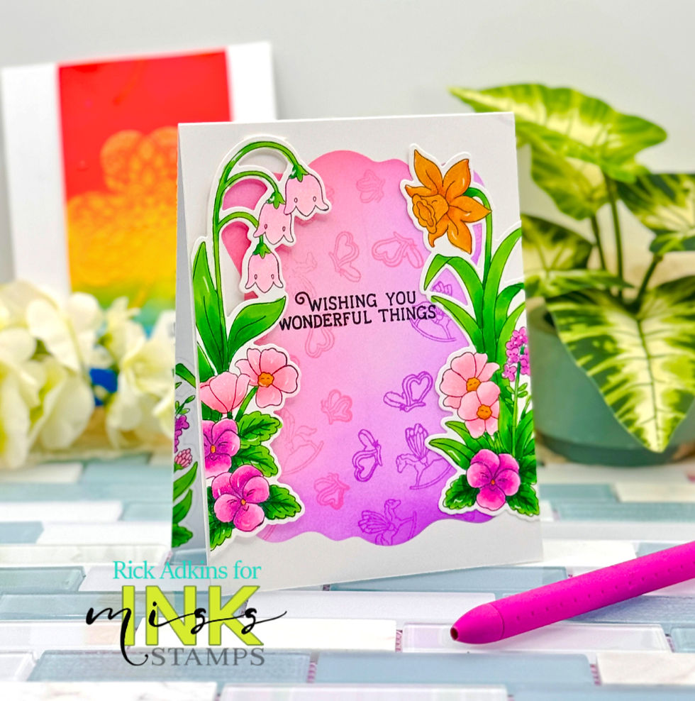
On the floral card, I used the March 2026 Free With Purchase 6 x 6 Stencil Watercolor Blob from Miss Ink Stamps to create a soft, ink-blended area that acts as a visual anchor. That shape does a lot of work—it defines where your eye should go and gives your focal images a place to sit without needing extra layers.
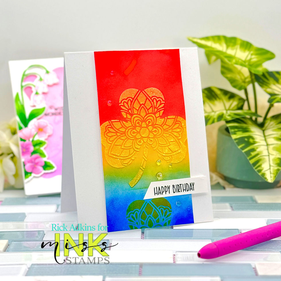
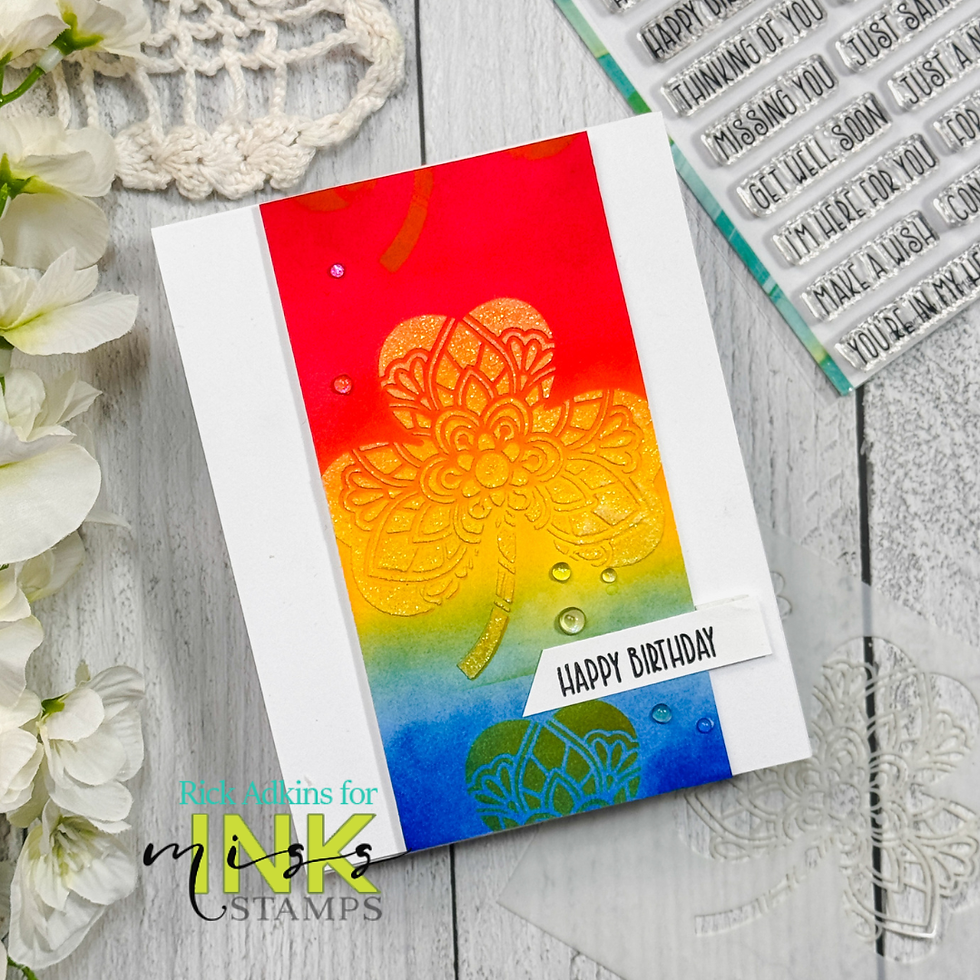
On the clover card, the March 2026 4 x 4 Thank You Stencil Clover becomes the focal point itself. Instead of sitting quietly in the background, it’s layered, repeated, and even highlighted with glitter paste to build dimension.
Same idea. Two totally different results.
Soft vs. Bold: Choosing the Right Approach
One thing I always think about before I start blending ink is the feeling I want the card to have.
For the floral design, I kept everything soft—pinks, purples, and gentle blending. The loose shape of the stencil paired with the Wildflower Stamp Set creates a natural, almost watercolor look. I added some light background stamping to fill the space, but kept it subtle so it wouldn’t compete with the florals.
On the rainbow clover card, I went in the opposite direction. Bright red, yellow, and blue blending creates strong contrast right away. Then, by layering the clover stencil multiple times—and adding glitter paste to the center—I was able to build depth without adding extra cardstock layers.
If you’ve ever struggled with cards feeling “flat,” this is a great approach to try.

A Simple Way to Add Interest Without Overcomplicating
A lot of cardmakers think adding dimension means adding more pieces. But that can quickly get overwhelming (and bulky for mailing).
Instead, both of these cards rely on:
Layered ink blending
Strategic stencil placement
A mix of soft and bold textures
The floral card uses die cut images from the Wildflower Stamp Set cut out with the Wildflower Coordinating Outline Dies to add dimension, but the real depth comes from that blended background and the way the florals frame it.
The clover card skips die cuts altogether and lets the stencil do all the work—especially with that pop of glitter paste right in the center. I used the Happy Birthday sentiment from the Everyday Sentiments Stamp Set to finish it off along with a few dew drop embellishments.
Two different approaches, both clean and simple.
Common Mistakes to Watch For
If you’re working with stencils and ink blending, here are a few things to keep in mind:
Too much pressure when blending can create harsh edges instead of smooth transitions
Overcrowding your design can take away from the impact of the stencil
Skipping contrast can make everything blend together (especially with softer color palettes)
One easy fix? Step back and look at your card before you add anything else. If your eye doesn’t know where to go, that’s your cue to simplify.
Make It Work with What You Have
You definitely don’t need these exact products to try this idea.
Any organic-shaped stencil can give you that soft focal area for florals
Any repeating stencil pattern can be layered to create depth like the clover design
Swap florals for seasonal images or even sentiments to change the theme
Try different color combos—pastels for spring, warm tones for fall, or monochromatic for a more elegant look
This is one of those techniques that grows with you. The more you experiment, the more you’ll start to see new possibilities in your stash.

Final Thoughts
Both of these cards started with the same goal: keep it simple, but make it interesting. And that’s really what stencil work does best—it gives you structure without limiting your creativity.
If your cards have been feeling a little flat lately, try layering your stencils or using them in unexpected ways. You might be surprised how much depth you can create without adding a single extra layer.
Watch the Video
If you’re a visual learner, you can watch the full process come together here: 2 Stencils, 2 Totally Different Cards (So Easy!)
If you have problems watching the video here on my blog you can always watch it on my YouTube Channel by Clicking Here!
I’d love to know—which style do you gravitate toward more… soft florals or bold and bright? And if you give this technique a try, be sure to come back and share how it worked for you!
(Wondering what I used in this video? Everything is linked to multiple sources in the thumbnails at the end of this post, or in the text below. Compensated affiliate links used when possible). As always I appreciate your support of my videos!
Materials Used:
Here you will find the list of supplies that I used to create today's card. All supplies are linked to supply sources below. Compensated affiliate links may be used at no cost to you.
Happy Crafting,

Rick Adkins
Affiliate Disclaimer:
Just a friendly reminder, as part of my commitment to transparency, please note that some of the links provided maybe affiliate links. This means that if you make a purchase through these links, I may earn a small commission at no extra cost to you. Your support is truly appreciated!
Additionally, I kindly ask that you always accept the tracking cookie for the affiliate websites. Rest assured, this will not in any way expose your computer to viruses or compromise your information. It's simply necessary for the company to attribute the sale to the affiliate, ensuring creators like myself receive their rightful commissions.
Your trust and support enable me to continue sharing creativity through my email lists, blog, and YouTube channel. Thank you for being a valued part of our crafting community!


Comments