
Kiss It, Kiss It, Spank It! Making a Cheeky Handmade Card

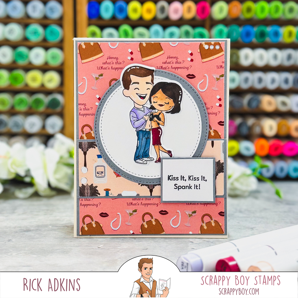
Sometimes a handmade card calls for pretty florals and a heartfelt sentiment, and sometimes it needs a little humor and personality! For this project, I wanted to create a card that would make someone smile while giving me an opportunity to play with bold patterned paper, character stamping, and alcohol marker coloring. The result is this cheeky handmade card featuring the Fabulous & Flawed collection from Scrappy Boy Stamps. Between the playful characters and the sentiment, this design definitely has a personality of its own!

Balancing Bold Patterned Paper with a Strong Focal Point
One of the things I enjoy about patterned paper is how much character it can bring to a handmade card without requiring a lot of additional embellishment. The Fabulous & Flawed 6x9 Pattern Paper Pack has plenty of personality, so I decided to let the patterns do some of the visual work. I used the contrasting pink and illustrated panels to create interest across the card front, then added gray cardstock borders to help separate the patterns and give the design a more finished appearance. When working with bold paper collections, I find that the key is not necessarily choosing quieter patterns, but giving each pattern a purpose. A little separation between busy areas helps the eye move around the design instead of feeling overwhelmed by everything happening at once.

Creating a Focal Point with Stamped Images and Circle Dies
With so much happening in the background, I needed a strong focal point to bring everything together. The stamped couple from the Fabulous & Flawed Stamp Set became the centerpiece, and the Stitched Circle Nesting Die Set helped frame the image. I like using circles when I want to soften a card design filled with straight edges and rectangular panels. The rounded shape creates contrast, draws attention toward the stamped characters, and gives them a defined space to stand out. The layered gray and white circles also connect the focal image to the gray matting around the patterned paper. This is a simple design principle you can use with almost any stamp set: repeat a color or shape in more than one area of your card to make the entire composition feel intentional.
Using Alcohol Markers to Bring Character Stamps to Life
Coloring is another opportunity to make a stamped image feel like it belongs in the overall design. I used alcohol markers to add color to the characters, choosing shades that complement the patterned paper without competing with it. The blue jeans, lavender shirt, warm skin tones, and burgundy skirt give the figures enough contrast to remain easy to see against the lighter circular background. When I color character images, I try to think beyond simply choosing my favorite colors. I consider which areas need the most contrast and where a darker shade can help define the image. You don't need an extensive marker collection to achieve this effect, either. A few coordinating colors, along with a light and dark shade where possible, can add plenty of dimension. If alcohol markers aren't your preferred coloring medium, colored pencils or water-based markers can work beautifully, too.

Making the Sentiment Part of the Design
The sentiment, “Kiss It, Kiss It, Spank It!”, is certainly not an everyday greeting! Because the words are such an important part of the card's humor, I wanted them to be easy to read without distracting from the stamped couple. The rectangular sentiment panel provides a visual counterpoint to the circle focal point, while the gray mat ties it back to the other layers. Notice how the sentiment overlaps the lower portion of the circle rather than sitting completely apart from the main image. That overlap helps connect the two elements and creates a more layered look. It's a useful trick whenever a card has several focal elements: allow them to interact a little so the design feels connected. The Fabulous & Flawed Outline Dies also make it easier to cut out the stamped characters cleanly, giving you flexibility when positioning the image on a layered card.

Making This Card Design Your Own
You can take the same basic layout and make it work with supplies already in your craft room. Try a floral paper collection for a softer look, geometric patterns for a more modern feel, or seasonal papers for a holiday or birthday card. If your patterned paper is especially busy, use a larger circle or oval with a plain cardstock background to give your stamped image more breathing room. You can also swap the circle dies for a rectangle, oval, or even a simple hand-cut panel. The important thing is to maintain a little contrast between the background, focal image, and sentiment. If you're new to layering patterned paper, start with two coordinating designs and one solid cardstock color before adding more patterns. Once you see how those elements work together, it's much easier to experiment with a bolder combination.

I had fun combining the Fabulous & Flawed Stamp Set, coordinating Outline Dies, patterned paper, and Stitched Circle Nesting Dies from Scrappy Boy Stamps to create this humorous handmade card. More importantly, this project is a reminder that good card design isn't about having every new supply or following a fixed set of rules. It's about understanding how color, pattern, shape, and contrast work together to tell a little story. Whether you recreate this design with the same products or give it your own spin using supplies from your stash, I hope it encourages you to experiment, embrace a little humor, and make something that reflects your personality. After all, the most memorable handmade cards are often the ones that feel like they could only have come from you!
Watch the Video
If you have problems watching the video here on my blog you can always watch it on the Scrappy Boy Stamps YouTube Channel by Clicking Here!
(Wondering what I used in this video? Everything is linked to multiple sources in the thumbnails at the end of this post, or in the text below. Compensated affiliate links used when possible). As always I appreciate your support of my videos!
Supplies Used
Here you will find the list of supplies that I used to create today's card. All supplies are linked to supply sources below. Compensated affiliate links may be used at no cost to you.
Happy Crafting,

Rick Adkins
Affiliate Disclaimer:
This post contains affiliate links. If you choose to shop through these links, I may earn a small commission at no extra cost to you. Thank you so much for supporting my business!


Comments