
Make A Splash Summer Card Idea: C. C. Designs New July Release
- Rick Adkins

- Jul 11, 2025
- 4 min read
Updated: Aug 9, 2025
Every time summer rolls around, I find myself reaching for stamps that bring a little sunshine into the craft room. You know the ones—barefoot, beach-ready, and full of personality. That’s exactly what today’s card is all about. I’m sharing a sweet and simple summer card I created using the brand-new Sugarplum Summer Stamp Set from C.C. Designs’ July Release, and it just makes me smile. These little characters are perfect for creating cheerful beach scenes, and the best part? The whole card came together in a fun, easy layout that you could recreate with your favorite summer stamps too.
I don’t know about you, but I love when a card feels like a little story. This one reminds me of days at the local lake growing up—just the right mix of water, sunshine, and sandy toes. And whether you’re a scene builder or just want to try something different with your pattern paper stash, there’s something here for everyone.

Make A Splash Summer Card Idea: C. C. Designs New July Release
Creating the Scene: A Little Sand, A Little Splash
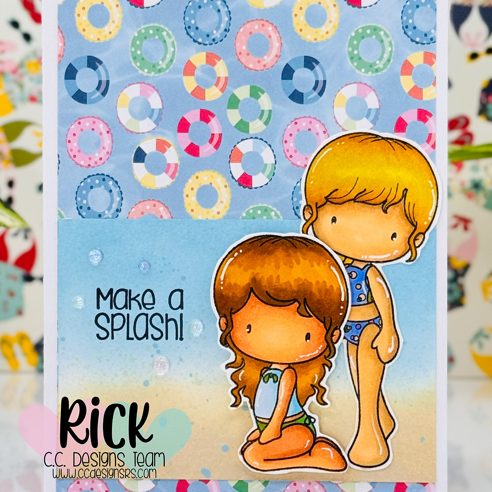
For this card, I started by stamping two of the girls from the Sugarplum Summer Stamp Set in Memento Tuxedo Black Ink on OLO Blending Cardstock. These images are so easy to color—each has big open spaces and charming details, which makes them ideal for alcohol markers. I used my Ohuhu Honolulu Brush Markers to bring them to life and added a few white gel pen highlights for extra pop.
Once they were colored and fussy cut (yes, I’m still one of those paper snippers—I find it super relaxing), I knew I wanted to ground them in a mini scene. I grabbed a scrap of Bristol Smooth Cardstock and blended Tumbled Glass, Antique Linen, and Frayed Burlap Distress Oxide Inks to create a soft beachy background. I flicked on some water mixed with those same ink colors to give it a splashy, textured look that reminds me of sand and sea mist. It’s a small detail, but it really pulls the whole scene together.
Pro Tip: When ink blending small panels like this, always start your blending off the edge of the paper and work inward in light, circular motions. It keeps your blends soft and even—perfect for scenes like this one.

Let Pattern Paper Do Some of the Work
Now, let’s talk background. I’ve been waiting for the perfect moment to use this ring float pattern from the Sun Kissed 6 x 6 Pattern Paper Pad by Echo Park, and this was it. It has such a playful, poolside feel and instantly set the tone for the card. I trimmed it down to 4" x 5 1/2" and adhered it to a top-folding A2 card base made from Neenah Ultra Thick Cardstock (my go-to for sturdy card bases).

Placing the ink-blended panel right over that patterned paper created a perfect spot for the girls to “stand” and “sit” while keeping the overall design light and playful. The floaty background almost acts like a crowd at the pool party!
Pro Tip: When working with bold pattern paper, use a smaller panel in a soft neutral or ink blend to give your focal point room to breathe. It helps everything feel balanced.
Finishing Touches That Make It Shine
Once my scene and background were in place, I stamped the “Make a Splash!” sentiment—also from the Sugarplum Summer Stamp Set—in Versafine Clair Nocturne Ink. I love how crisp and bold this ink is, especially over Oxides.
To give a bit of dimension, I added foam tape behind the sitting girl to make her pop just a little. Then, I sprinkled on a few Iridescent Dew Drops from Pinkfresh Studio around the sentiment. They catch the light just enough to look like water droplets—so simple, but they add a lot of charm.
Pro Tip: Don’t underestimate the power of subtle embellishments. A few strategically placed dew drops or sequins can bring movement and texture without overwhelming your card.

Why This Layout Works
This layout is one of my favorites because it’s versatile and easy to adapt. By pairing a strong patterned background with a blended focal panel, you get contrast and interest without having to build a full-blown scene. The Sugarplum Summer characters steal the show here, and the layers help support them without adding bulk.
If you're looking for a layout that makes the most of your summer stamp sets and helps you use up some of that pretty pattern paper we all collect, this one’s a great option to try. It’s sweet, simple, and splashy—in all the best ways.

Thanks for stopping by and celebrating the C.C. Designs July Release with me. I hope this card inspires you to make a splash with your next crafty session. Let me know what you’d create with this adorable new stamp set—I’d love to hear!
Wondering what I used in this project? Everything is linked to multiple sources in the thumbnails in the Materials Used section, or in the text below. Compensated affiliate links used when possible.
Materials Used:
Here you will find the list of supplies that I used to create today's card. All supplies are linked to supply sources below. Compensated affiliate links may be used at no cost to you.
Happy Stampin'

Rick Adkins
Affiliate Disclaimer:
Just a friendly reminder, as part of my commitment to transparency, please note that some of the links provided maybe affiliate links. This means that if you make a purchase through these links, I may earn a small commission at no extra cost to you. Your support is truly appreciated!
Additionally, I kindly ask that you always accept the tracking cookie for the affiliate websites. Rest assured, this will not in any way expose your computer to viruses or compromise your information. It's simply necessary for the company to attribute the sale to the affiliate, ensuring creators like myself receive their rightful commissions.
Your trust and support enable me to continue sharing creativity through my email lists, blog, and YouTube channel. Thank you for being a valued part of our crafting community!


Comments