
Tranquil Water Lilies Card Idea | Easy Ink Blending with Dies & Stencils | Video Tutorial
- Rick Adkins

- Jul 17, 2025
- 5 min read
Updated: Oct 5, 2025
There are some card layouts I return to again and again—and this one has quickly become a favorite. I created a version of this card just yesterday using a cooler color palette and different sentiment, and it had such a calming effect that I decided to revisit the design today with a warmer, more vibrant twist. What’s so great about this kind of layout is that it gives you a simple structure to work with, but you can completely change the look and feel just by swapping colors, layering your elements differently, or picking a new sentiment. It’s a great little creative refresh when you’re in the mood to make, but don’t want to reinvent the wheel.
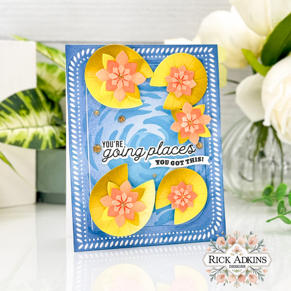
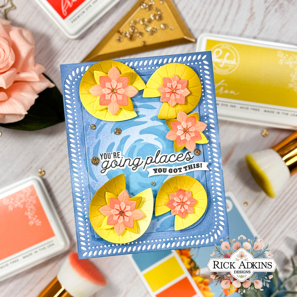
This version of the card features products from Pinkfresh Studio that are perfect for layered ink blending: the Tranquil Water Lilies Die Set and Stencils, the Mark the Moments Stamp Set and coordinating dies, and that beautifully detailed Rounded & Braided Rectangle Die Set. It’s a clean, layered design that looks more complex than it actually is—and that’s always a win in my book.

Tranquil Water Lilies Card Idea | Easy Ink Blending with Dies & Stencils | Video Tutorial
A Warmer Take on Tranquil Florals
For this version, I wanted to bring in some sunshine. I used Pinkfresh inks in Citron, Bay Leaf, and Spanish Moss for the lily pads and leaves, and then switched things up for the florals with Mimosa, Mango Sorbet, and Fruit Punch. The result? A much warmer card with a completely different feel than the cooler pinks and greens I used before.
These stencils from the Tranquil Water Lilies set make layering a breeze. Each section is thoughtfully designed so the colors sit beautifully on top of one another without feeling crowded or muddy. One pro tip I always share when working with bright tones like oranges and yellows: start light, blend softly, and layer up gradually. These colors are vibrant, and they can get overwhelming quickly if you go in too heavy at the start.
I used Hammermill Smooth 100 lb Cardstock, which continues to be my go-to for ink blending—it holds the ink well without warping and gives you a smooth surface to work with.
Light, Layered Water Background
Once the florals were finished and die cut using the coordinating dies, I moved on to the background. This part of the stencil set is sometimes overlooked, but it’s honestly what brings everything together. I went with Sky Blue and Summer Showers for the water areas, and then added just a touch of Storm ink around the edges for a little extra drama.
This subtle edge blending trick is one I reach for often—it adds focus to the center of the card and gives everything a soft frame without needing an extra layer of paper. It’s also a great way to add contrast when your background colors are light and airy.

Structure with the Rounded & Braided Rectangle Dies
To give the card a finished, framed feel, I used the Rounded & Braided Rectangle Die Set. The largest decorative frame creates this lovely lacy edge that adds just enough texture without making the card feel busy. I also cut out the center using the coordinating rectangle die and popped it up using 2mm foam tape for a bit more depth.
This kind of framing works really well when you want your focal point (in this case, those bright florals) to shine. Plus, it gives you a chance to add dimension without piling on extra layers—something I always think about when I know I’ll be mailing a card.

Encouragement That Pops
For the sentiment, I went with “You're Going Places” and the smaller “You Got This,” both from the Mark the Moments Stamp Set. This set has quickly become a staple in my craft space—it’s packed with encouraging phrases that are easy to mix and match. The smaller sentiment fits perfectly inside one of the little banners included in the coordinating die set, which adds a nice, finished look without needing a ton of extra effort.
To give the sentiment a little extra weight on the card, I stacked a few blank die cuts behind it. This is one of those small steps that can make a big difference. Not only does it lift the sentiment off the card just enough, but it also gives it a more polished, substantial feel.

Finishing Touches with Sparkle
To complete the card, I layered the lilies into a loose arrangement around the sentiment and added a few Gold Glitter Drops for a final touch of sparkle. I usually keep embellishments minimal when working with bold colors and detailed stenciling, but a few well-placed drops can really bring the whole design to life. I like to cluster them near the florals or in open areas of the background—it helps the eye move around the card without distraction
Same Layout, Brand New Look
What I love most about this card is that it feels totally different from yesterday’s version, even though the layout is the same. Changing up your color palette, flipping a sentiment, or even just swapping embellishments can give you an entirely new look without having to start from scratch.
If you ever find yourself staring at your craft desk feeling unsure where to start, try revisiting a card design you’ve already made and loved. Look at it with fresh eyes, and ask yourself: What if I changed the color story? What if the mood shifted from soft and sweet to bold and bright? This kind of creative exercise keeps things fun and takes the pressure off when you’re in a bit of a creative lull.
There’s a full video tutorial included if you’d like to see the blending and layering in action, and I hope it inspires you to pull out your florals and try a twist on a favorite layout of your own.
Tranquil Water Lilies Card Idea | Easy Ink Blending with Dies & Stencils Video Tutorial
If you have problems watching the video here on my blog you can always watch it on my YouTube Channel by Clicking Here!
(Wondering what I used in this video? Everything is linked to multiple sources in the thumbnails at the end of this post, or in the text below. Compensated affiliate links used when possible). As always I appreciate your support of my videos!
Materials Used:
Here you will find the list of supplies that I used to create today's card. All supplies are linked to supply sources below. Compensated affiliate links may be used at no cost to you.
Happy Stampin'

Rick Adkins
Affiliate Disclaimer:
Just a friendly reminder, as part of my commitment to transparency, please note that some of the links provided maybe affiliate links. This means that if you make a purchase through these links, I may earn a small commission at no extra cost to you. Your support is truly appreciated!
Additionally, I kindly ask that you always accept the tracking cookie for the affiliate websites. Rest assured, this will not in any way expose your computer to viruses or compromise your information. It's simply necessary for the company to attribute the sale to the affiliate, ensuring creators like myself receive their rightful commissions.
Your trust and support enable me to continue sharing creativity through my email lists, blog, and YouTube channel. Thank you for being a valued part of our crafting community!


Comments