
Using the C. C. Designs Pink Green Stamp Set for a Polished Character Card
- Rick Adkins

- Mar 2
- 5 min read
There’s something so fun about a bold, character-driven handmade card — especially when it leans into a playful, theatrical theme. For this card, I wanted to create a Wicked-inspired design that felt bright and confident without becoming overwhelming. When you’re mixing pinks, greens, pattern paper, and a focal character, things can go from polished to chaotic very quickly.
In today’s project, I focused on using a simple, structured layout to keep everything balanced. The video walks through the full creative process — from stamping to OLO marker coloring to bringing in patterned paper — but here I want to share the design thinking behind the decisions. Because once you understand the why, you can recreate this look with almost any supplies in your stash.

The Power of an Easy Card Layout
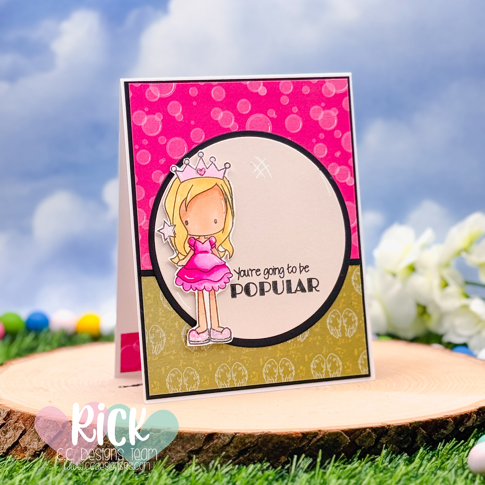
When working with character stamps — especially ones with personality like the Pink Green Stamp Set from C. C. Designs — the biggest mistake I see is overbuilding the background. We love our patterned paper. We love our dies. We want to use all the things.
But character cards shine when they have room to breathe.
That’s why I chose a strong circular focal area layered over two coordinating patterned papers from the Chance to Fly Pattern Paper Pack by Scrappy Boy Stamps. The circle does a few important things:
It instantly frames the stamped image
It softens busy patterns
It creates a visual pause in the design
Instead of competing with the character, the background supports her.
If you ever feel stuck trying to “fill space,” try anchoring your design with a large shape — circle, oval, stitched rectangle, or even a simple mat layer. Structure creates confidence.
Why Pattern Paper Mixing Works Here
Mixing patterned paper can feel intimidating, especially when the colors are bold. The trick isn’t finding perfectly matching patterns — it’s controlling contrast.
On this card, I paired:
A bright, energetic pink bubble pattern
A softer green print with subtle imagery
The top pattern grabs attention. The bottom pattern grounds the design. The black matting pulls everything together and keeps it from feeling too sweet.
When mixing pattern paper, ask yourself:
Is one pattern dominant?
Is one pattern quieter?
Do I have a neutral or dark element to anchor everything?
If the answer is yes to those three, you’re on the right track.

OLO Marker Coloring: Keeping It Clean and Intentional
I used OLO Markers for coloring because they blend beautifully without requiring complicated layering. For a character like this, I focus on:
Light-to-mid-tone blends
Clean highlight placement
Keeping shadows simple
A common mistake with character stamps is over-shading. When we try to add too much dimension, the image can start to look muddy — especially with bright clothing.
Instead, I let the bold pink dress be bold. I didn’t overwork it. Clean coloring actually makes patterned backgrounds look more intentional because nothing feels heavy.
If you’re newer to alcohol marker coloring, this is a great type of image to practice on. Simple shapes. Clear sections. High contrast colors.

Why This Layout Solves So Many Design Problems
This “easy card design” formula works because it simplifies decision-making:
Strong focal shape
Two patterned papers (one bold, one subtle)
Cleanly colored character
Sentiment tucked into the focal area
It removes the guesswork.
You don’t have to wonder:
Should I add embellishments?
Do I need texture paste?
Is this missing something?
The layout itself carries the design.
This approach is especially helpful when:
You’re making multiple cards
You’re short on time
You want to highlight a specific stamp set
You’re creating for a design team or brand feature
It feels finished without feeling fussy.

How to Adapt This with Your Own Supplies
You absolutely do not need these exact products to make this idea work.
Try this with:
Any character stamp (seasonal, birthday, holiday, encouragement)
Scrap patterned paper from your stash
A stitched circle die or even a hand-cut circle
Any alcohol markers or colored pencils
You could easily:
Swap the pink/green combo for red/black for Halloween
Use pastels for a spring birthday
Try neutrals for a more sophisticated look
The key is contrast and balance — not the specific brand.
If you’re a beginner, keep your patterns simpler.If you’re more advanced, try adding subtle ink blending behind the focal circle.
Same formula. Different flavor.

Final Thoughts
Character cards don’t have to be complicated to feel polished. In fact, the cleaner and more intentional the layout, the stronger the impact.
If you’ve ever struggled with busy backgrounds or felt unsure about mixing patterned paper, I hope this gives you a framework you can reuse again and again. Start simple. Let your stamped image shine. Trust your layout.
Video Tutorial:
If you’re a visual learner, watching the process come together will make everything click.
You can watch the full process here:C. C. Designs Pink Green Stamp Set Card | OLO Coloring & Pattern Paper Design
If you have problems watching the video here on my blog you can always watch it on my YouTube Channel by Clicking Here!
I’d love to hear — do you prefer bold pattern mixes or subtle backgrounds when working with character stamps? Let me know in the comments, and if you haven’t seen the video yet, be sure to check it out for the full creative walkthrough.
(Wondering what I used in this video? Everything is linked to multiple sources in the thumbnails at the end of this post, or in the text below. Compensated affiliate links used when possible). As always I appreciate your support of my videos!
Materials Used:
Here you will find the list of supplies that I used to create today's card. All supplies are linked to supply sources below. Compensated affiliate links may be used at no cost to you.
Happy Crafting,

Rick Adkins
Affiliate Disclaimer:
Just a friendly reminder, as part of my commitment to transparency, please note that some of the links provided maybe affiliate links. This means that if you make a purchase through these links, I may earn a small commission at no extra cost to you. Your support is truly appreciated!
Additionally, I kindly ask that you always accept the tracking cookie for the affiliate websites. Rest assured, this will not in any way expose your computer to viruses or compromise your information. It's simply necessary for the company to attribute the sale to the affiliate, ensuring creators like myself receive their rightful commissions.
Your trust and support enable me to continue sharing creativity through my email lists, blog, and YouTube channel. Thank you for being a valued part of our crafting community!


Comments