
Easy Cardmaking Idea: Clean and Simple Card with Ink Blending
- Rick Adkins

- May 4
- 5 min read
Sometimes the hardest part of cardmaking isn’t the techniques—it’s deciding what to do in the first place. If you’ve ever sat at your craft table with supplies out and no clear plan, you’re not alone. That’s exactly why I love having a go-to layout that takes the guesswork out of the process.
For this project, I focused on a quick and easy clean and simple card that you can pull together without overthinking. I walk through the full process in the video, but here I wanted to share the design thinking behind it—so you can take the idea and make it work with whatever you already have on hand.

Why This Layout Works Every Time
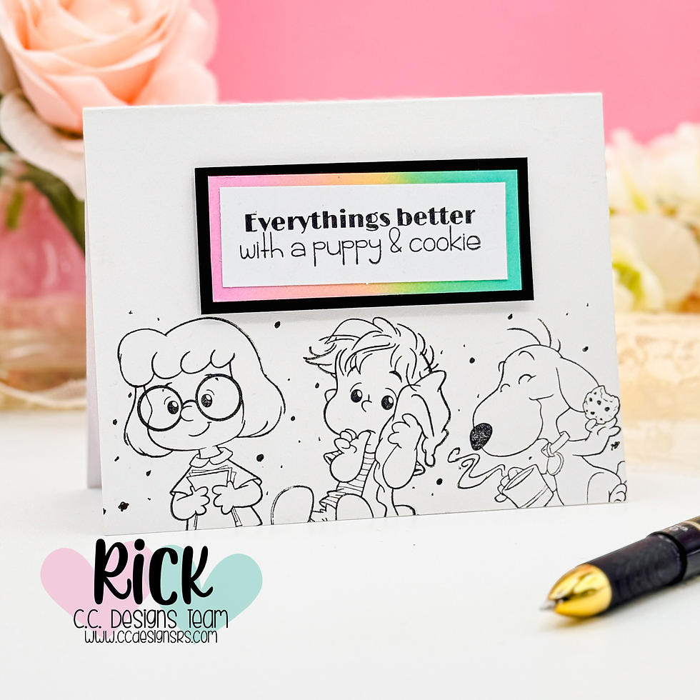
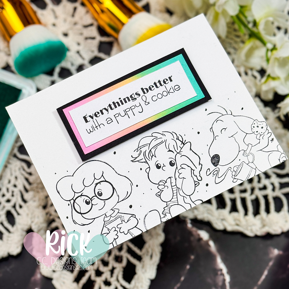
This design is built around a simple horizontal panel, and that’s really the key. It gives you a defined space to work in, which immediately removes a lot of decision fatigue. Instead of wondering where everything should go, you’re just filling a clearly structured area.
Placing the sentiment in a framed panel above the images creates a natural visual hierarchy. Your eye reads the sentiment first, then moves down to the stamped characters. It feels balanced without needing layers, embellishments, or extra details.
The white space around the panel is just as important as what’s inside it. Clean and simple designs rely on that breathing room to keep everything looking polished instead of busy. It’s a great reminder that you don’t need to fill every inch of your card to make it feel complete.
Using Stamping + Ink Blending Together
One of my favorite things about this card is how stamping and ink blending work together without competing for attention.
I kept the stamped images in simple black line art, which lets the soft ink blending really shine. That contrast—bold lines with a soft background—is what gives the card interest while still keeping it clean.
The ink blending here acts more like a subtle frame than a focal point. By lightly blending color around the edges of the sentiment panel, you add just enough color to guide the eye without overwhelming the design.
If you’ve ever felt like your ink blending looks too heavy or patchy, this approach helps solve that. You’re not trying to cover a large area—just adding soft color in a controlled space.

A Simple Solution for “I Don’t Know What to Make”
This kind of layout is perfect for those days when you want to make something—but don’t want to think too hard about it.
It solves a few common problems:
Not knowing where to place your images
Overcomplicating your design with too many elements
Feeling like you need lots of supplies to make something “good”
By limiting the layout and focusing on just two techniques—stamping and ink blending—you’re giving yourself a clear path from start to finish.
Why This Stamp Set Works So Well
The More Pals Stamp Set from C. C. Designs is a great fit for this style of card because the images have enough personality to stand on their own. You don’t need elaborate coloring or extra embellishments to make them feel complete.
I also like that the characters can be grouped together in a row, which works perfectly with this horizontal layout. It makes building a scene feel easy and natural, especially if you’re newer to cardmaking.
And the sentiment fits nicely into a framed area, which helps reinforce that structured, clean look without extra effort.
Make It Work with What You Have
You definitely don’t need these exact supplies to use this idea. That’s the beauty of a layout like this—it’s incredibly flexible.
Here are a few easy ways to adapt it:
Swap in any small character stamps or even florals
Use a single image instead of a group for a simpler look
Change the ink blending colors to match a season or occasion
Skip the blending entirely and use patterned paper behind the sentiment
If you’re more of a beginner, keep everything minimal—black stamping and one or two ink colors. If you’re ready to experiment, you can add light coloring or extra detail without changing the overall structure.

A Few Things to Watch Out For
Clean and simple cards can actually feel tricky because there’s nowhere to hide mistakes. A couple of small tips can make a big difference:
Keep your stamping crisp and well-aligned
Use a light hand with ink blending—build color gradually (slowly)
Don’t overcrowd your panel—give your images space
Remember, the goal isn’t perfection. It’s clarity and simplicity.

Watch the Process
If you’re a visual learner, this will really help you see how everything comes together:
You can watch the process here…(“Simple Card Layout That Works Every Time”)
If you have problems watching the video here on my blog you can always watch it on my YouTube Channel by Clicking Here!
Final Thoughts
This is one of those designs you can come back to again and again—especially when you’re short on time or feeling stuck. It’s simple, flexible, and gives you consistently polished results without a lot of effort.
Don’t worry about making it perfect. Try the layout, adjust it to your style, and see what works for you. And if you haven’t watched the video yet, it’s a great companion to help bring the idea to life.
I’d love to hear how you’d adapt this design with your own supplies—or what you tend to struggle with most when starting a card.
(Wondering what I used in this video? Everything is linked to multiple sources in the thumbnails at the end of this post, or in the text below. Compensated affiliate links used when possible). As always I appreciate your support of my videos!
Supplies Used
Here you will find the list of supplies that I used to create today's card. All supplies are linked to supply sources below. Compensated affiliate links may be used at no cost to you.
Happy Crafting,

Rick Adkins
Affiliate Disclaimer:
Just a friendly reminder, as part of my commitment to transparency, please note that some of the links provided maybe affiliate links. This means that if you make a purchase through these links, I may earn a small commission at no extra cost to you. Your support is truly appreciated!
Additionally, I kindly ask that you always accept the tracking cookie for the affiliate websites. Rest assured, this will not in any way expose your computer to viruses or compromise your information. It's simply necessary for the company to attribute the sale to the affiliate, ensuring creators like myself receive their rightful commissions.
Your trust and support enable me to continue sharing creativity through my email lists, blog, and YouTube channel. Thank you for being a valued part of our crafting community!


Comments