
How to Combine Pattern Paper and Die Cutting for Eye Catching Handmade Cards
- Rick Adkins

- 12 minutes ago
- 5 min read
Sometimes a card starts with a stamp set, sometimes it starts with a color palette, and occasionally it begins with a single element that sparks an idea. For this encouragement card, that element was the dragon.
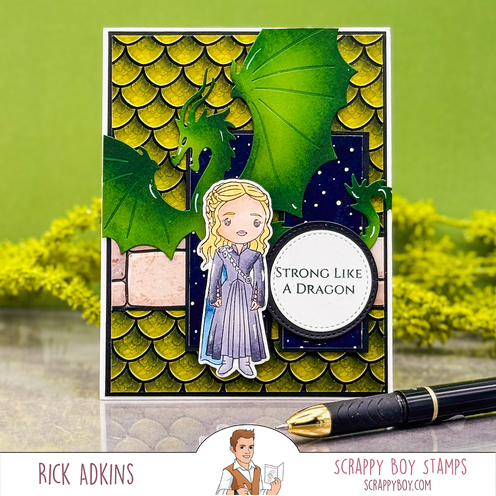
As cardmakers, it's easy to look at a detailed patterned paper and wonder how to use it without overwhelming the rest of the design. The Dragon Kingdom collection from Scrappy Boy Stamps immediately caught my eye because of the bold scale pattern and fantasy-inspired theme. Rather than treating the patterned paper as a simple background, I wanted it to become part of the storytelling while still allowing the focal elements to stand out.
The result is a handmade encouragement card that combines patterned paper, die cutting, stamping, and coloring to create a design with plenty of visual interest while maintaining a clear focal point.

Let the Pattern Paper Do Some of the Work
One of the biggest lessons I've learned over the years is that patterned paper doesn't always need a lot of extra embellishment. When a paper already contains strong texture, movement, or visual detail, it can carry much of the design on its own.
The dragon scale pattern from the Dragon Kingdom 6x9 Paper Pack immediately established the fantasy theme of the card. Because the scales create so much texture and repetition, I didn't need to add complicated background techniques or multiple layers of embellishments.
This is a strategy I often recommend to cardmakers who feel overwhelmed by patterned paper. Instead of covering most of it up, allow the paper to become a featured design element. Then build your focal point in a way that complements rather than competes with it.

Creating Contrast with Die Cuts
The large dragon die cut (created with the Dragon Die Set) became the visual anchor for this card.
Whenever I use a busy background, I look for opportunities to create contrast. In this case, the dragon's bold silhouette helps break up the repeating scale pattern while reinforcing the theme.
To make the die cut stand out even more, I used ink blending to add depth and dimension to the dragon. Ink blending on die cuts is one of my favorite ways to create a custom look without adding a lot of extra supplies. The gradual color shifts help flat die cuts feel more dynamic and can instantly draw the eye toward your focal area.
This technique works especially well with character, animal, floral, or seasonal dies. Even simple shapes can gain a lot of visual impact with a little ink blending.
Why I Chose This Character Image
One of the fun things about cardmaking is that we don't always have to use products exactly as they were intended.
For this card, I chose a character from the Clash of Crowns Stamp Set simply because I liked how she fit the overall story I wanted the card to tell. Her appearance paired naturally with the dragon and helped reinforce the fantasy-inspired theme.
When building themed cards, I often encourage cardmakers to look across different stamp sets rather than limiting themselves to a single collection. Sometimes the best combination comes from mixing products that weren't originally designed to be used together.
The character was colored with OLO Markers, which allowed me to keep the coloring soft and subtle. Because the dragon and patterned paper already bring a lot of visual energy to the design, softer coloring on the character helped maintain balance.

Using Layers to Guide the Eye
One design principle I return to frequently is creating visual paths for the viewer.
On this card, the layered rectangles, circular sentiment element, character image, and dragon all work together to guide the eye around the design. Rather than placing everything in a straight line, overlapping elements create movement and encourage viewers to explore the card.
The sentiment, "Strong Like a Dragon," (from Dragon Kingdom Stamp Set) serves as both a focal point and a message of encouragement. By framing it inside a stitched circle, it remains easy to read despite the detailed background and surrounding imagery.
Whenever you're working with multiple focal elements, framing techniques like circles, labels, or stitched shapes can help create visual organization and prevent a design from feeling cluttered.

Ways to Adapt This Design
One of the things I enjoy most about this layout is how easily it can be adapted.
If dragons aren't your style, try substituting:
Floral die cuts for a garden-themed card
Butterflies for an encouragement or friendship card
Seasonal images for holiday cards
Animal silhouettes for masculine card designs
You can also swap the scale-patterned paper for woodgrain, brick, plaid, or floral prints while keeping the same basic design concept.
The key idea is to pair a bold patterned background with a large die-cut focal element and then support it with a character, sentiment, or secondary image.
This approach works across a wide variety of themes and occasions.

Final Thoughts
One of the most rewarding parts of cardmaking is discovering new ways to combine supplies you already own. Sometimes a patterned paper collection inspires the background, while a die set provides the focal point. Other times, a favorite stamp image becomes the starting point.
The more willing we are to mix products, experiment with layouts, and look beyond intended combinations, the more creative possibilities we uncover.
If you've been hesitant to use bold patterned papers or large die cuts together, I encourage you to give it a try. With a little contrast, thoughtful layering, and a clear focal point, these elements can work together beautifully to create handmade cards that feel both eye-catching and meaningful.
Watch the Video
If you have problems watching the video here on my blog you can always watch it on my YouTube Channel by Clicking Here!
(Wondering what I used in this video? Everything is linked to multiple sources in the thumbnails at the end of this post, or in the text below. Compensated affiliate links used when possible). As always I appreciate your support of my videos!
Supplies Used
Here you will find the list of supplies that I used to create today's card. All supplies are linked to supply sources below. Compensated affiliate links may be used at no cost to you.
Happy Crafting,

Rick Adkins
Affiliate Disclaimer:
Just a friendly reminder, as part of my commitment to transparency, please note that some of the links provided maybe affiliate links. This means that if you make a purchase through these links, I may earn a small commission at no extra cost to you. Your support is truly appreciated!
Additionally, I kindly ask that you always accept the tracking cookie for the affiliate websites. Rest assured, this will not in any way expose your computer to viruses or compromise your information. It's simply necessary for the company to attribute the sale to the affiliate, ensuring creators like myself receive their rightful commissions.
Your trust and support enable me to continue sharing creativity through my email lists, blog, and YouTube channel. Thank you for being a valued part of our crafting community!


Comments