
How to Layer Alcohol Markers and Colored Pencils for Beautiful Handmade Cards

There’s something so satisfying about creating a clean and simple handmade card that still feels rich with detail. Sometimes, the easiest layouts are the ones that really let your coloring shine, and that was exactly the goal with these two cards. I wanted each design to feel polished and complete without relying on lots of embellishments or layers, so I focused on combining alcohol marker coloring, colored pencil shading, and a few simple scoring details to add depth and texture.
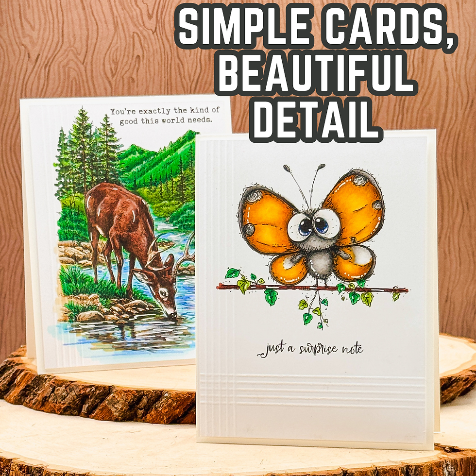
Both of these cards use the same general idea—clean layouts with a strong focal image—but they each have a very different feel. One is a peaceful masculine scene card with a natural outdoor setting, and the other is a whimsical butterfly “just a note” card with bright cheerful color. Even though the themes are different, the same techniques tie them together beautifully. That’s one of the things I love most about learning a few foundational cardmaking techniques: once you understand why they work, you can apply them to almost any style.
Why Layering Markers and Pencils Works So Well
One of my favorite ways to add depth to stamped images is by layering colored pencils over alcohol markers. Alcohol markers are perfect for laying down a smooth base layer of color quickly. They give you even coverage and help establish the main color palette for your card. But sometimes, marker coloring alone can look a little flat—especially if you’re working with detailed images or want softer transitions.
That’s where colored pencils come in.
Adding colored pencils over your alcohol marker base allows you to deepen shadows, enhance texture, and define details in a way that feels much more forgiving than trying to achieve every bit of shading with markers alone. This is especially helpful for beginner cardmakers who may not feel confident with advanced marker blending yet. Instead of trying to do everything with one medium, you can let the markers handle the base color and let the pencils refine the image.
On the deer card, this layering technique brings the wooded background to life. The alcohol markers establish the greens, browns, and blues in the scene, while the pencils add contrast and texture to the fur, rocks, and trees. Those extra details create dimension without making the card design complicated.
On the butterfly card, the same approach gives the wings a soft, shaded glow while keeping the image bright and playful. The pencils add just enough depth to make the butterfly pop against the clean white background.

The Power of Clean and Simple Design
When I’m using detailed stamped images like the The Wild Haven Background Stamp or the A Thought Flew By Stamp Set from Unity Stamps, I often choose a clean and simple card design because it allows the coloring to be the focal point.
It can be tempting to keep adding layers, embellishments, or patterned paper, but sometimes the strongest design choice is restraint.
Leaving open white space around the stamped image creates breathing room for the eye. It draws attention to the focal point and makes all those carefully added coloring details stand out more. This is especially important when working with detailed scenic stamps or whimsical images that already carry a lot of visual interest.
The deer card is a great example of this. The scenic image is naturally detailed, so keeping the rest of the design minimal lets the artwork take center stage. The butterfly card uses the same principle in a lighter, more playful way, allowing the bright wings and expressive image to shine.
This kind of layout is also wonderful for crafters who want cards that look polished but don’t require lots of supplies. A strong focal image, thoughtful coloring, and a clean background can go a long way.

Why Small Details Make a Big Difference
One of the easiest ways to add sophistication to a clean and simple card is with scoring patterns.
These scored lines might seem like a tiny detail, but they add subtle texture and structure without distracting from the focal image. Because the texture is tone-on-tone, it enhances the design quietly while keeping the card clean.
I especially love using score lines on minimal cards because they help fill open space in an elegant way. Instead of adding another layer of cardstock or an embellishment, the scoring creates visual interest while preserving that crisp, uncluttered look.
On the butterfly card, the score lines help anchor the image and create balance in the lower portion of the card. On the deer card, the scoring frames the scene and gives the card a finished, polished look.
This is one of those techniques that works with almost any card style, and it’s a perfect reminder that detail doesn’t have to mean complexity.

How to Adapt This Idea with Supplies You Already Have
One of the best things about these cards is that the overall concept can be recreated with almost any stamps in your collection.
If you don’t have scenic stamps like the deer image, try this technique with florals, birds, or even sentiment-focused designs. Any stamped image that has room for layered shading will benefit from the combination of markers and pencils.
You can also adapt the look based on your coloring comfort level. If alcohol markers aren’t your preferred medium, you could start with watercolor or ink blending and still use colored pencils to add detail. The important takeaway is the layering—starting with a base layer of color and then adding definition on top.
And if scoring isn’t part of your regular routine, this is a great detail to experiment with. Even a few simple score lines can make a basic card feel more intentional and refined.
That’s really the heart of good cardmaking design: using simple techniques thoughtfully.

Final Thoughts
These two cards are a great reminder that beautiful handmade cards don’t have to be complicated. A clean layout, layered coloring, and a few subtle details can create a card that feels both elegant and approachable.
If you’ve ever felt like your clean and simple cards needed “something more,” try looking at your texture and shading before reaching for extra embellishments. Often, the magic is in those quiet details—the added depth from colored pencils, the softness of layered color, or the understated texture from a few score lines.
Those simple choices are what turn a stamped image into a finished design.
And the best part? These are techniques you can use again and again with the supplies you already have. Once you get comfortable layering your coloring mediums and embracing white space, you’ll find that creating polished, dimensional cards becomes so much easier.
So pull out your favorite stamps, experiment with layering color, and give those simple designs room to shine—you may be surprised at just how much impact those little details can make.

Thanks for dropping by today I hope that you found a little spark of creative inspiration with my project today. Wondering what I used in this project? Everything is linked to multiple sources in the thumbnails in the Materials Used section, or in the text below. Compensated affiliate links used when possible.
Materials Used:
Here you will find the list of supplies that I used to create today's card. All supplies are linked to supply sources below. Compensated affiliate links may be used at no cost to you.
Happy Crafting,

Rick Adkins
Affiliate Disclaimer:
Just a friendly reminder, as part of my commitment to transparency, please note that some of the links provided maybe affiliate links. This means that if you make a purchase through these links, I may earn a small commission at no extra cost to you. Your support is truly appreciated!
Additionally, I kindly ask that you always accept the tracking cookie for the affiliate websites. Rest assured, this will not in any way expose your computer to viruses or compromise your information. It's simply necessary for the company to attribute the sale to the affiliate, ensuring creators like myself receive their rightful commissions.
Your trust and support enable me to continue sharing creativity through my email lists, blog, and YouTube channel. Thank you for being a valued part of our crafting community!


Comments