
Easy Spring Shaker Card Tutorial for Beautiful Handmade Cards
- Rick Adkins

- May 1
- 5 min read
There’s something about a shaker card that instantly makes a project feel extra special. The movement, the sparkle, and the little surprise inside all add a fun interactive element that catches the eye right away. But if you’ve ever felt intimidated by shaker cards, you’re definitely not alone. They often look much more complicated than they really are, and that can make them feel out of reach—especially if you’re newer to cardmaking.
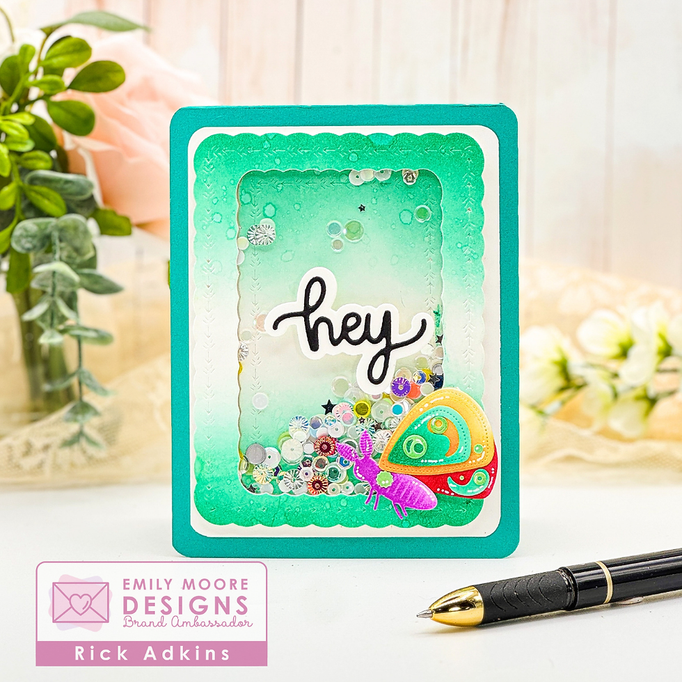
For this Spring Hey Shaker Card, I wanted to create something bright, cheerful, and interactive while keeping the design simple and approachable. In the video, I walk through the full process so you can see how all the layers come together, but I also wanted to share some of the design thinking behind this card here—because understanding why certain choices work can make it much easier to apply the same ideas to your own handmade cards.

Why This Shaker Card Design Works
One of the easiest ways to make a shaker card feel polished without overcomplicating the design is to focus on one strong focal point. For this card, the shaker window becomes the centerpiece, while the colorful die cut moth and bold sentiment support that focal area without competing with it.
The scalloped frame helps define the shaker window and gives the card a finished look right away. Decorative frames like this are useful because they create visual structure, making even a simple design feel layered and intentional. Instead of filling the entire card front with details, concentrating the visual interest in one section helps the card feel balanced.
The soft ombré ink blended background also plays an important role in keeping the design cohesive. Using one ink color blended from dark to light creates depth while keeping the background subtle. This is especially helpful on shaker cards because it gives dimension behind the window without distracting from the shaker elements themselves.

Keeping Color Simple but Effective
One thing that helps this card stand out is the contrast between the soft aqua background and the rainbow ink blended moth. That pop of bright color draws the eye immediately, but because the rest of the design stays simple, it never feels overwhelming.
This is a great approach anytime you want to add lots of color without making the card look busy:choose one neutral or monochromatic area, then add one colorful focal element.
That strategy takes the guesswork out of color choices and makes it easier to create balance. It also helps prevent one of the most common cardmaking frustrations—adding too many colors in too many places and ending up with a design that feels chaotic.
Using the Make a Moth Stevie Die Set for the focal image worked especially well here because the layered pieces make it easy to blend several colors while still keeping the design clean and defined.
Why Shaker Cards Feel Difficult (and How to Simplify Them)
A lot of cardmakers avoid shaker cards because they seem fussy. Between building the window, adding the shaker elements, and lining everything up, it can feel like there are too many moving parts.
The easiest way to simplify the process is to keep the layout straightforward.
Instead of trying to create multiple shaker areas or adding several focal elements, this design uses:
one shaker window
one sentiment
one decorative embellishment
That’s it.
By limiting the number of design elements, the shaker feature becomes easier to build and the finished card feels cleaner. The Decorative Sentiments Die Set was perfect for this because the scalloped dies create a decorative frame that adds interest without requiring extra embellishments.
If shaker cards have felt overwhelming in the past, simplifying the layout first can make a huge difference.

Make the Idea Work with What You Have
One of my favorite things about this design is how easy it is to adapt with supplies you already own.
If you don’t have the exact dies I used, you can swap in:
any nesting frame dies for the shaker window
any bold word die for the sentiment
any layered spring image for the focal point
The design concept stays the same: a framed shaker window, a bold greeting, and one colorful accent image.
That means you can easily change the theme for birthdays, thank-you cards, baby cards, or even holiday cards just by switching the focal die cuts and sentiment. Once you understand the layout, the possibilities open up quickly.
This kind of adaptable design is especially helpful when you want to stretch your supplies while still creating cards that feel fresh and unique.

Let the Technique Do the Work
Sometimes the best card designs are the ones where the technique creates the wow factor for you.
On this card, the shaker window provides the movement and sparkle, while the ink blending adds softness and dimension. Because those techniques are doing the heavy lifting, the rest of the card can stay simple.
That’s a great reminder when a card design feels stuck—rather than adding more embellishments, ask yourself if one strong technique can create the interest instead.
Often, that leads to cleaner, more cohesive cards that are easier to finish and just as impressive.

Watch the Full Process
If you’d like to see how this spring shaker card comes together, you can watch the full video here:
Watching the process makes it much easier to see how the layers work together and how simple design choices can create a polished finished card.
If you have problems watching the video here on my blog you can always watch it on my YouTube Channel by Clicking Here!
Shaker cards may look intricate, but they don’t have to be complicated. By keeping the layout simple, limiting the focal elements, and letting a few key techniques shine, you can create interactive handmade cards that feel polished and fun without the stress.
If shaker cards have felt intimidating before, I hope this project encourages you to give them another try. Start simple, use what you have, and let the process be enjoyable. And if you haven’t watched the video yet, be sure to check it out—it will help bring all these ideas to life.
(Wondering what I used in this video? Everything is linked to multiple sources in the thumbnails at the end of this post, or in the text below. Compensated affiliate links used when possible). As always I appreciate your support of my videos!
Materials Used:
Here you will find the list of supplies that I used to create today's card. All supplies are linked to supply sources below. Compensated affiliate links may be used at no cost to you.
Happy Crafting,

Rick Adkins
Affiliate Disclaimer:
Just a friendly reminder, as part of my commitment to transparency, please note that some of the links provided maybe affiliate links. This means that if you make a purchase through these links, I may earn a small commission at no extra cost to you. Your support is truly appreciated!
Additionally, I kindly ask that you always accept the tracking cookie for the affiliate websites. Rest assured, this will not in any way expose your computer to viruses or compromise your information. It's simply necessary for the company to attribute the sale to the affiliate, ensuring creators like myself receive their rightful commissions.
Your trust and support enable me to continue sharing creativity through my email lists, blog, and YouTube channel. Thank you for being a valued part of our crafting community!


Comments